

Observation 1: Limited rescuer–vet communication
Rescuers dropped off animals without much direct engagement with veterinary staff.
Potential impact: gaps in health assessment and care decisions.
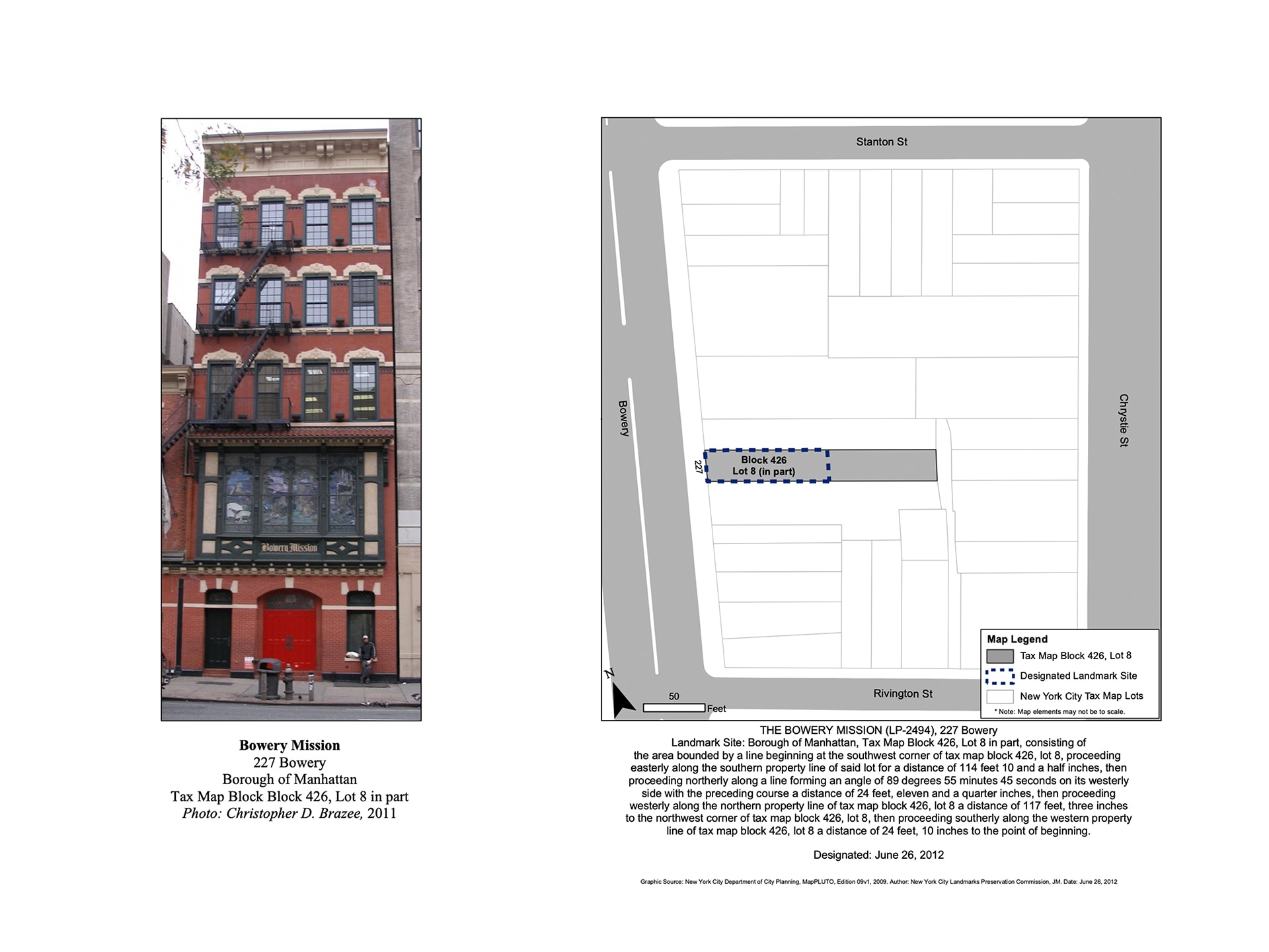
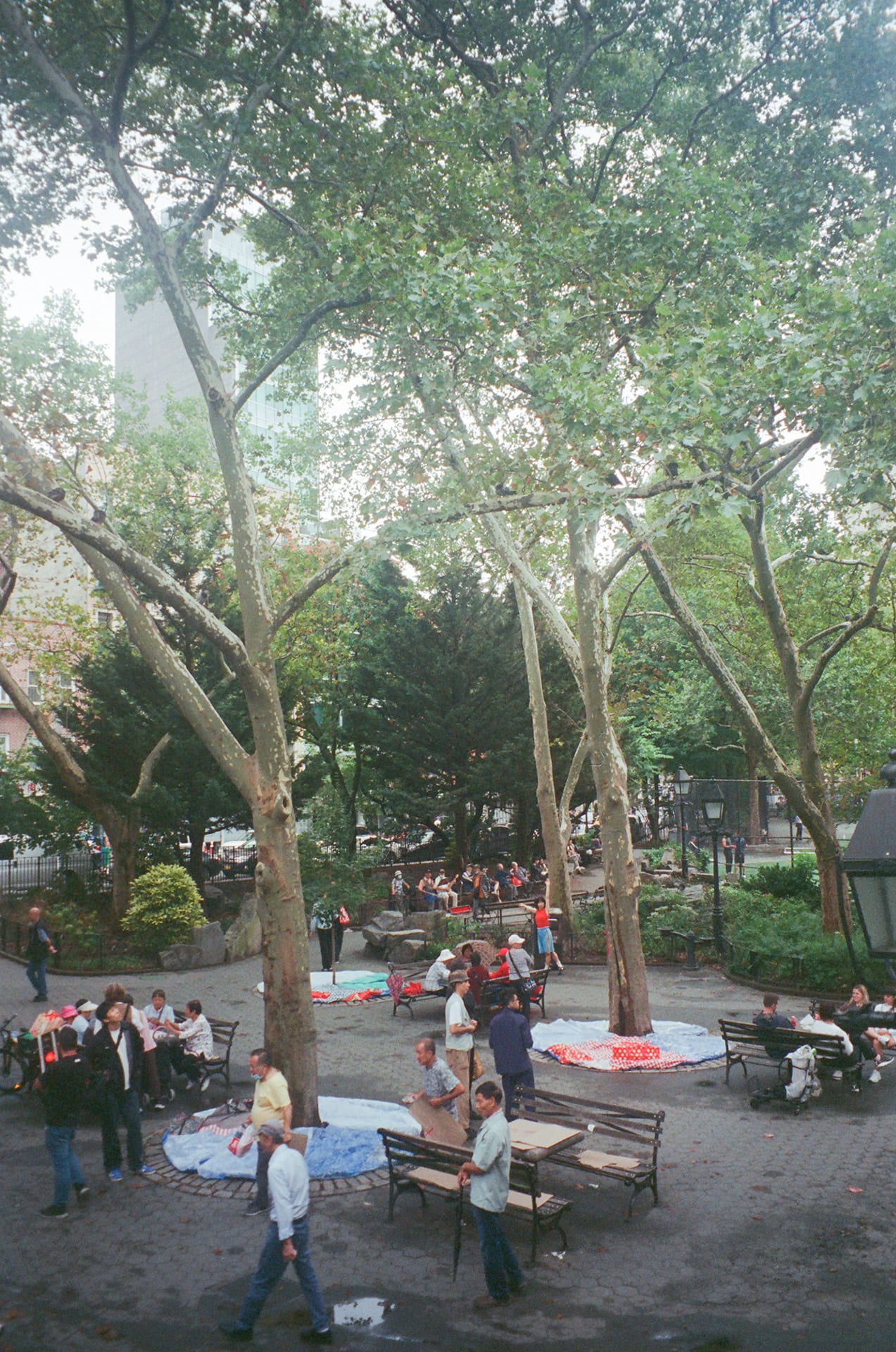
For the past four years I've been working at a bookstore in the Lower East Side. Whenever people ask where it is, I point to the New Museum as a reference. Yet just beside it stands a place with far longer history, one I rarely mention: the Bowery Mission, tucked beneath its scaffolding - its walkway occupied by pigeons or by the line of people waiting for meals and aid. The red door is always half-open, its interior withheld from view.
"
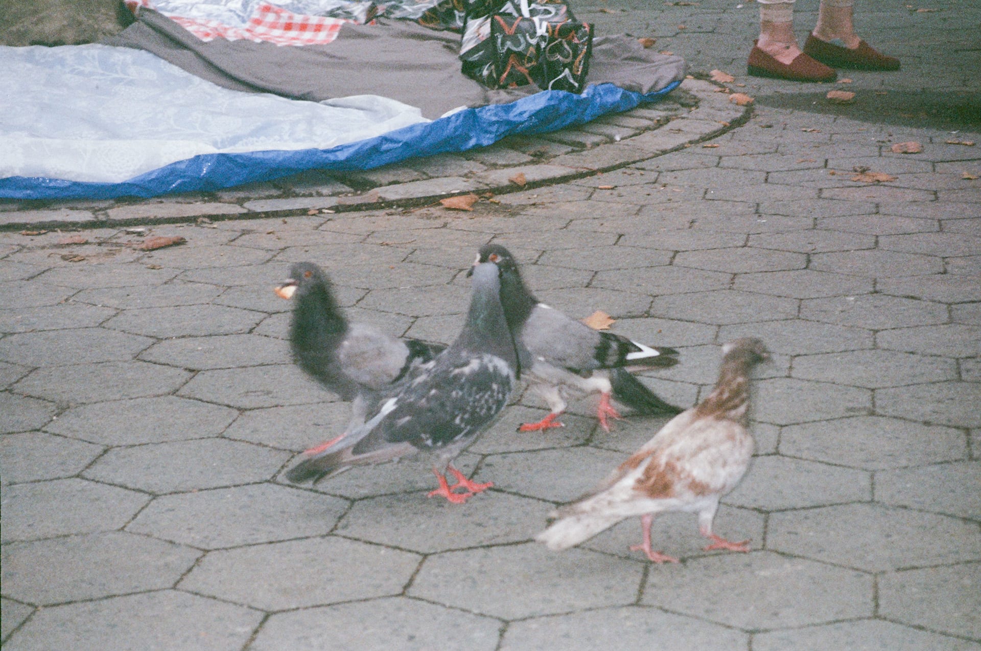
The line itself is a collage of faces and languages. When there aren't enough people to form a proper queue, those who have just received food sometimes break bread with the pigeons lingering nearby - a fragile moment of peace against the constant roar of Bowery's traffic. But proximity also brings unease. Those on their way to the Mission sometimes drift past the bookstore and step inside. Their behavior and clothing seem uniform, their purpose more direct, more stripped-down, and at times so random that it becomes harder to predict.
Whether their purpose truly conflicts with mine, or with the bookstore's, is not something I can know in advance. Still, tension surfaces all the same. My body reacts before thought, reading trust in a hem, a collar, a coat...and with it, to feel the gap stretch quietly, almost imperceptibly, yet further apart.
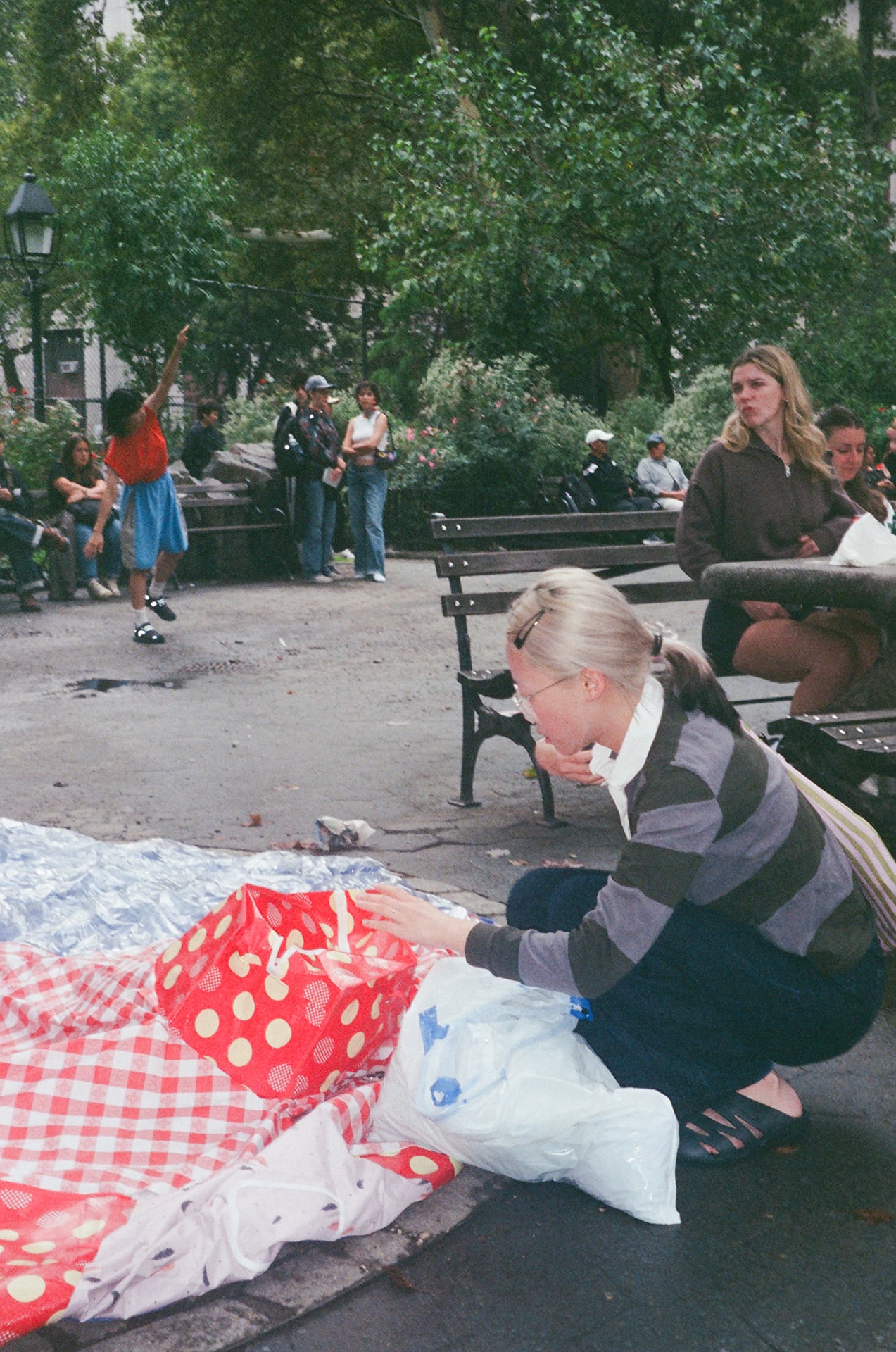
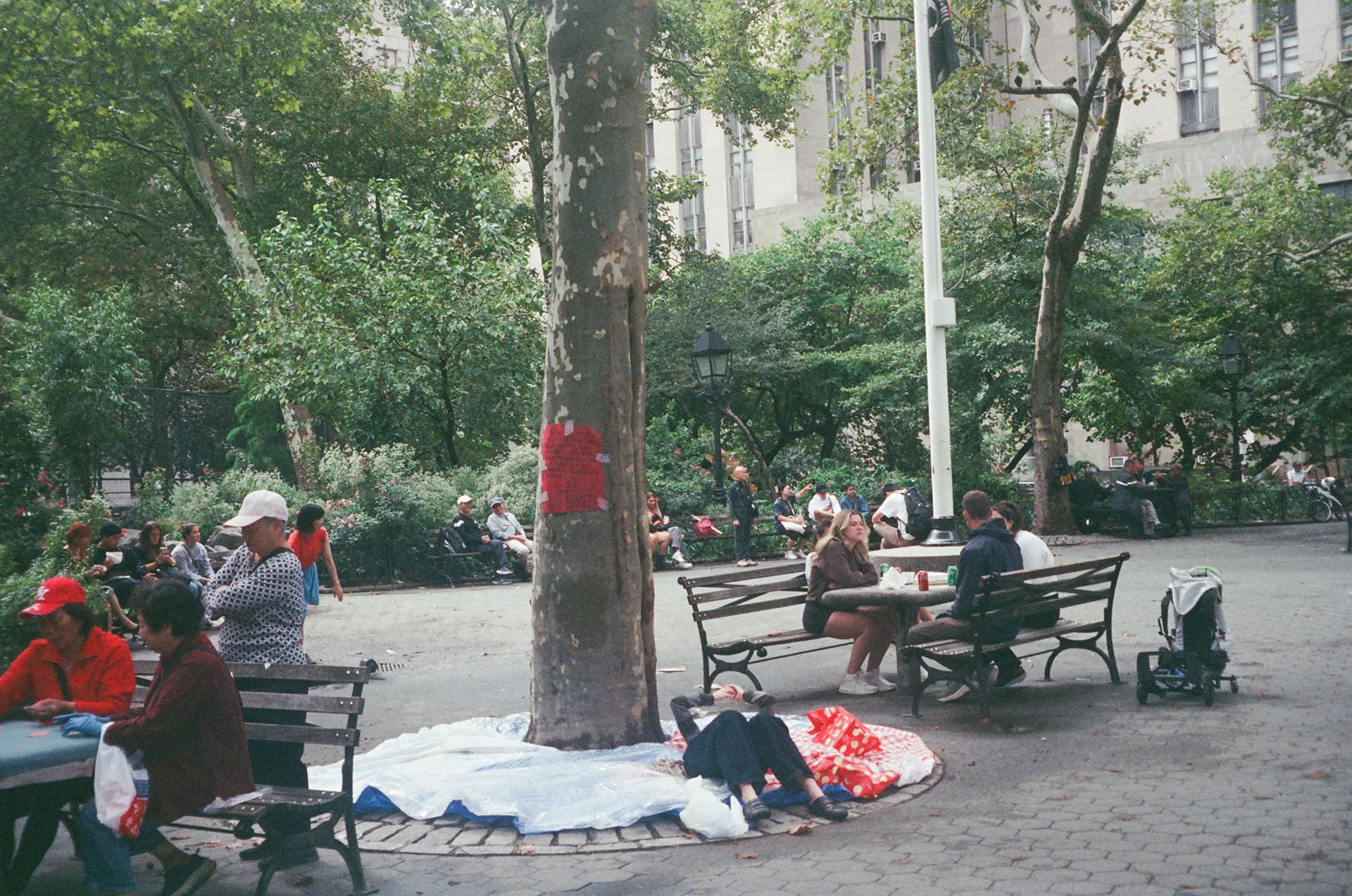
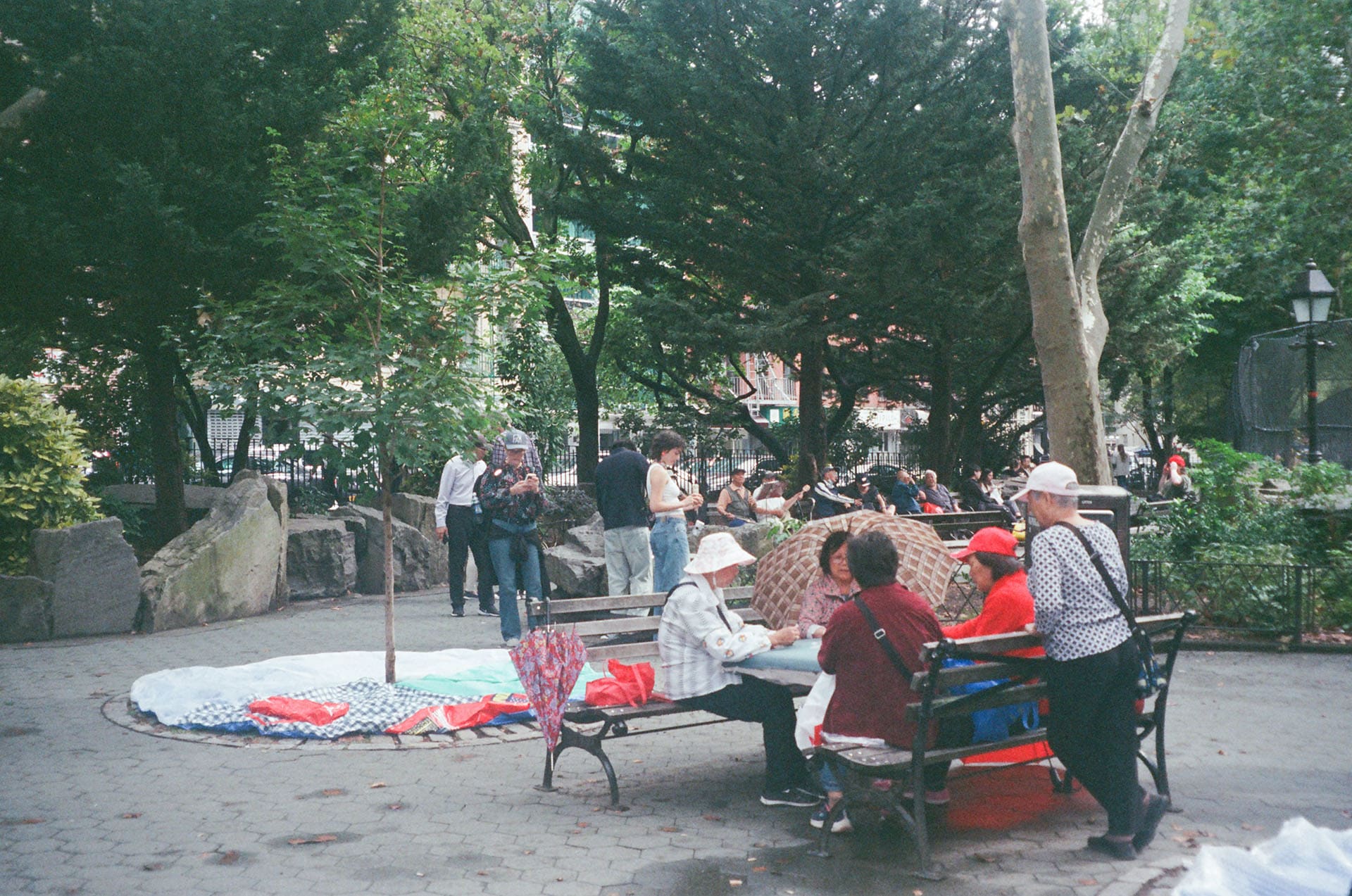
This project unfolds in a park, a public space, a surface without roof, a place where people wander, sometimes even live. It is the collection of infinite private spaces, and with the will to expand and blur our borders, we unsettle each other in uneasy peace. SOFT GROUND grows from this intention. It builds form from donations: three bubbles that swell and soften as they are filled with old belongings, a shared ground expanding through what is left behind.
Come by if you're available, at Columbus Park, Chinatown for People's Pavilion. Bring a few unwanted garments, or simply take a moment to sit and relax on the SOFT GROUND. All donations will go directly to the Bowery Mission."
31 pounds of recycled clothing collected on site were donated to the Bowery Mission a day after the event.
text & images by shuyu

This is an exhibition featuring a site-specific project initiated by Keiko Taniguchi and Tangent Essays.
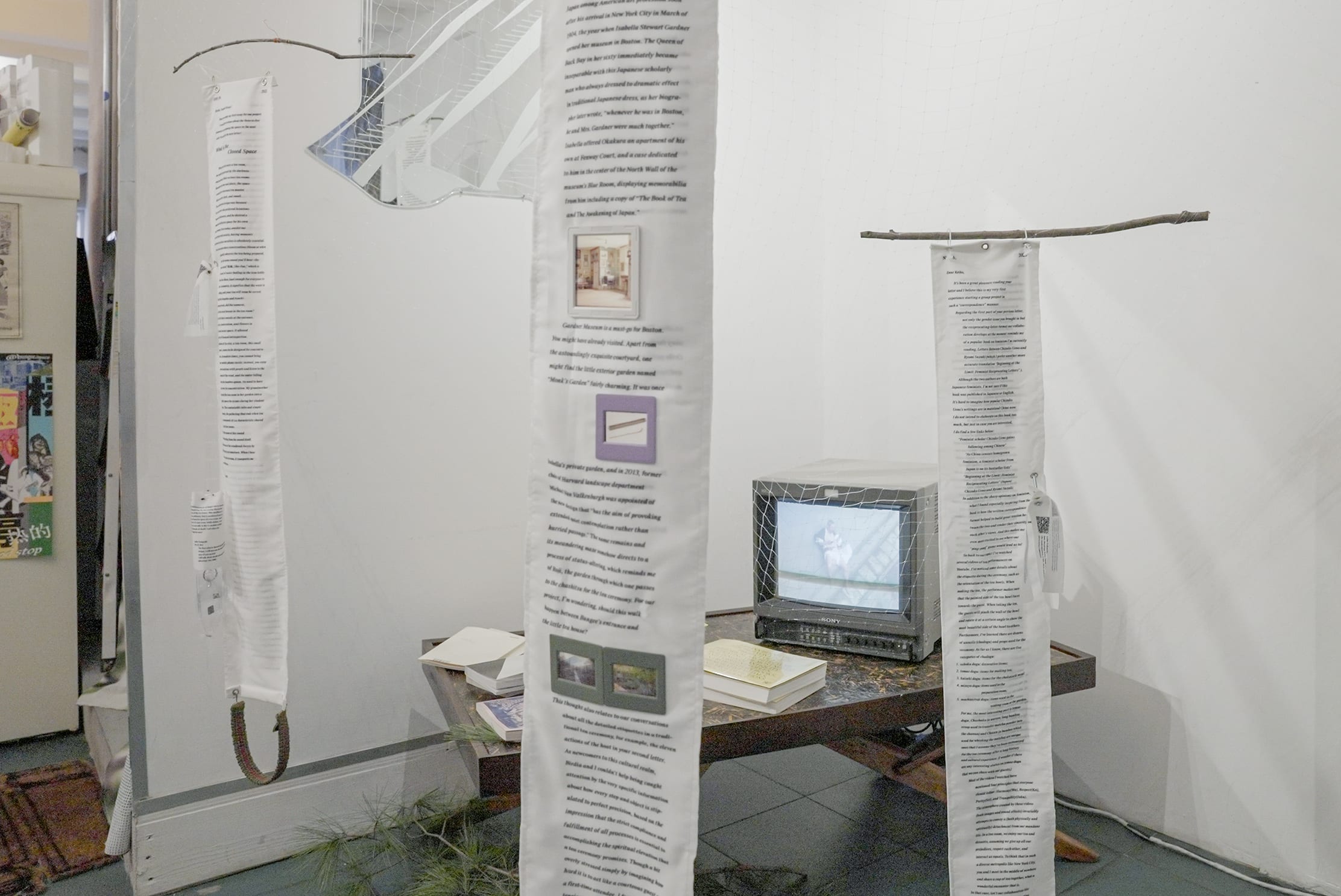
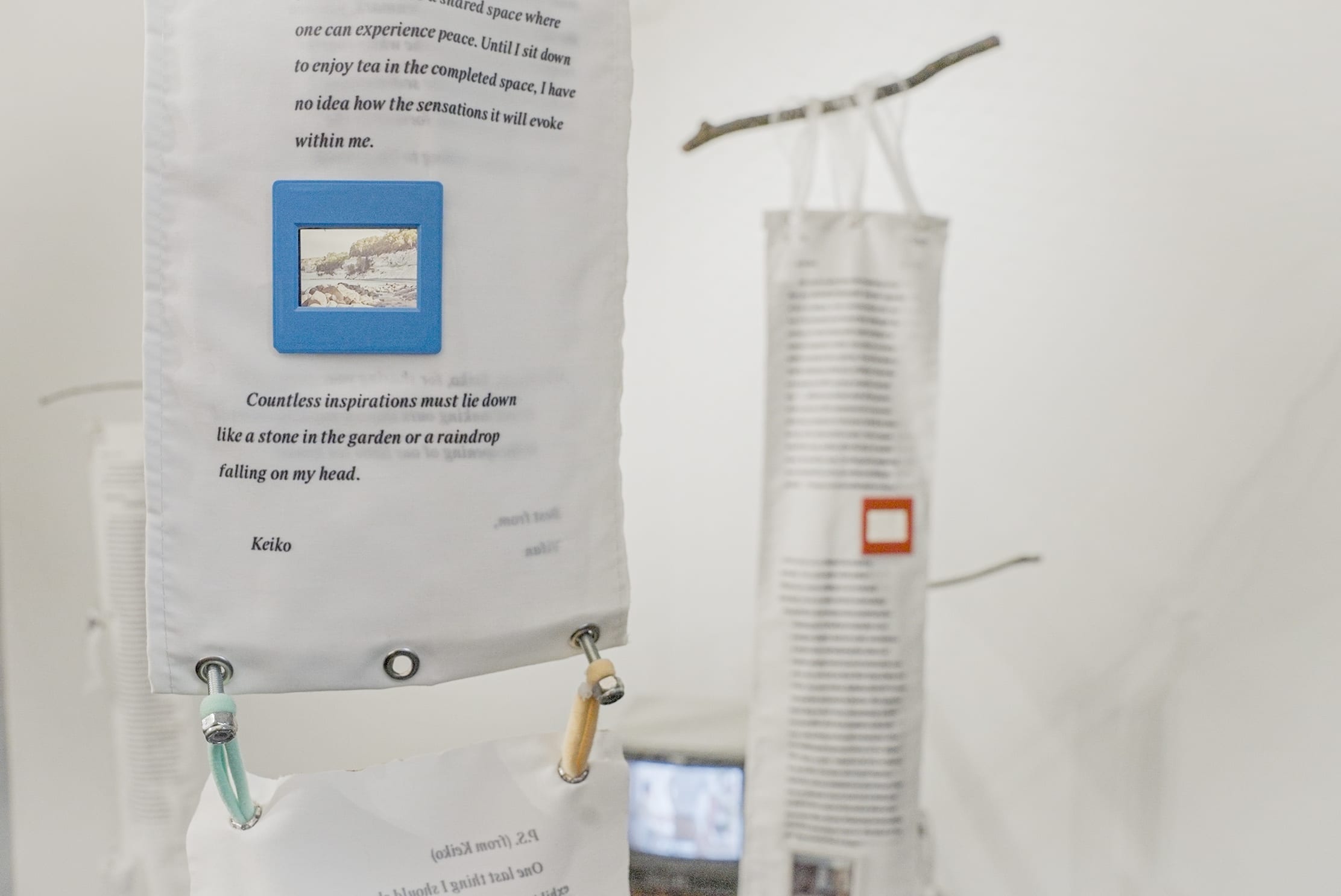
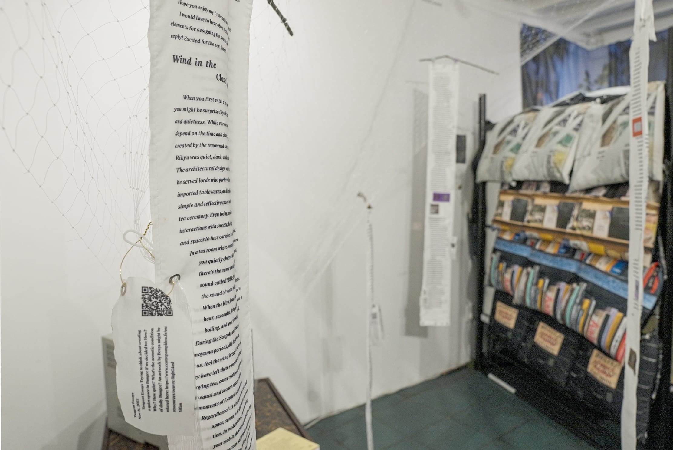
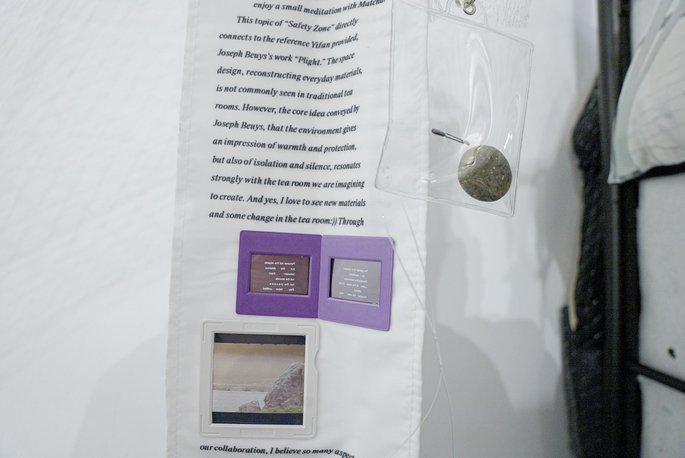
To showcase correspondence between Keiko Taniguchi and Tangent Essays, Shuyu Peng designs an installation that disrupts spatial perception by suspending a net from the ceiling over the tea room. This creates a tightly stretched conical shape, anchored by Taniguchi's video piece.
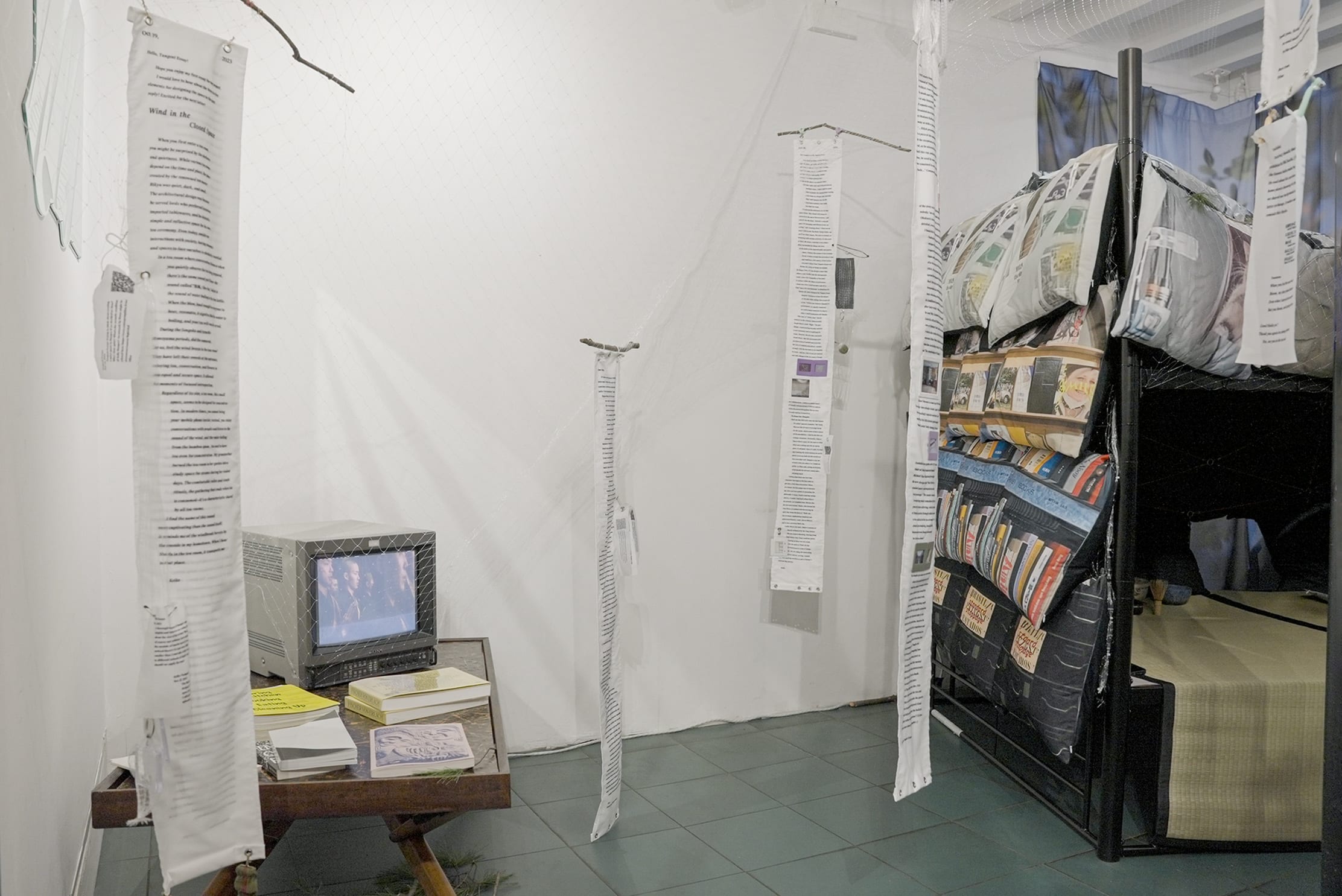
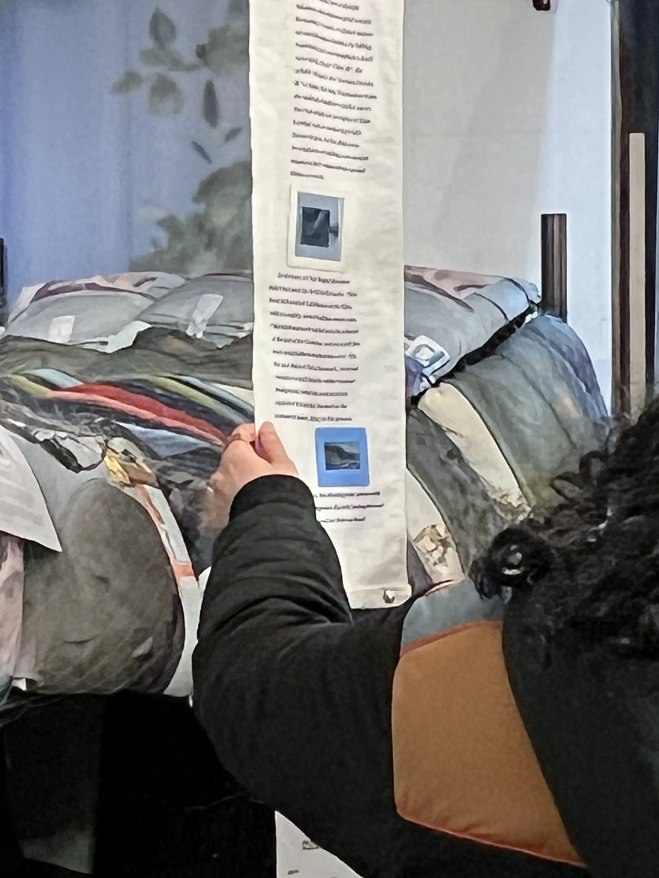
Audiences are compelled to maintain an uncomfortable posture as they navigate the space, interacting with letters printed on fabric resembling tea towels suspended from the net amidst the sounds of colliding weights attached to letters.
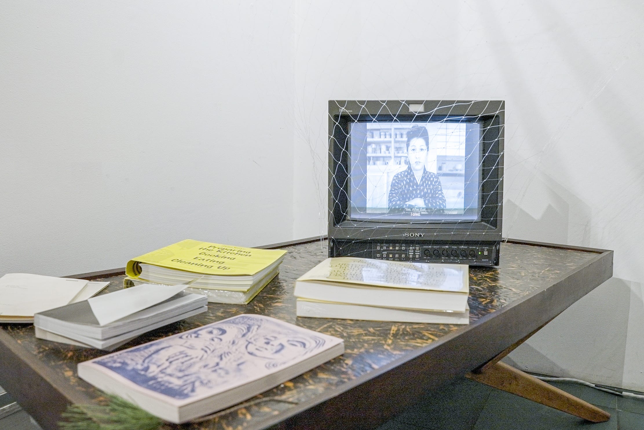
The exhibition's opening video by Keiko Taniguchi blends silent film humor with Japanese movie clips, showcasing the tea ceremony and daily tea culture. It delves into gender roles, from samurai traditions to postwar practices, addressing contemporary challenges faced by tea practitioners navigating evolving gender dynamics.
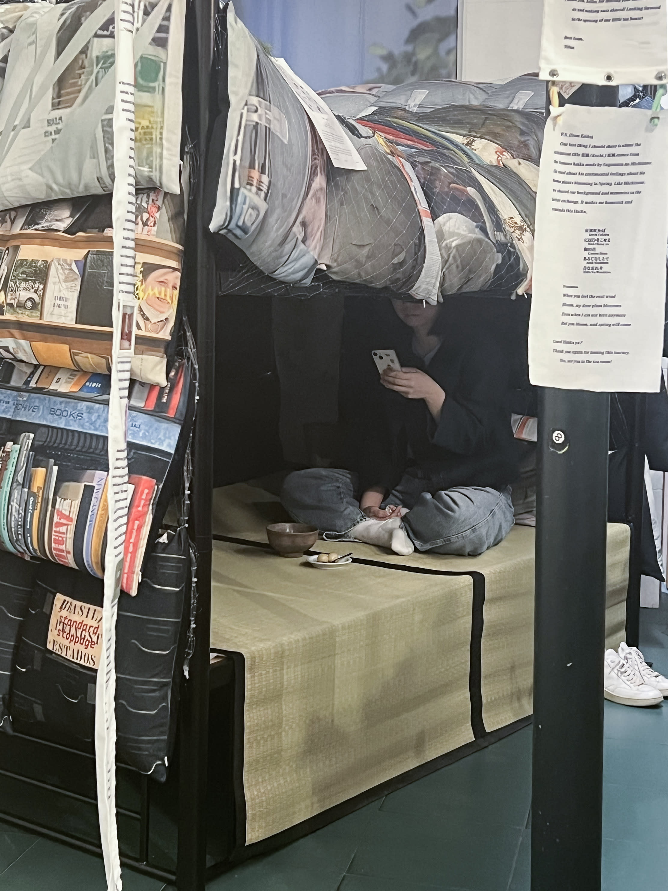
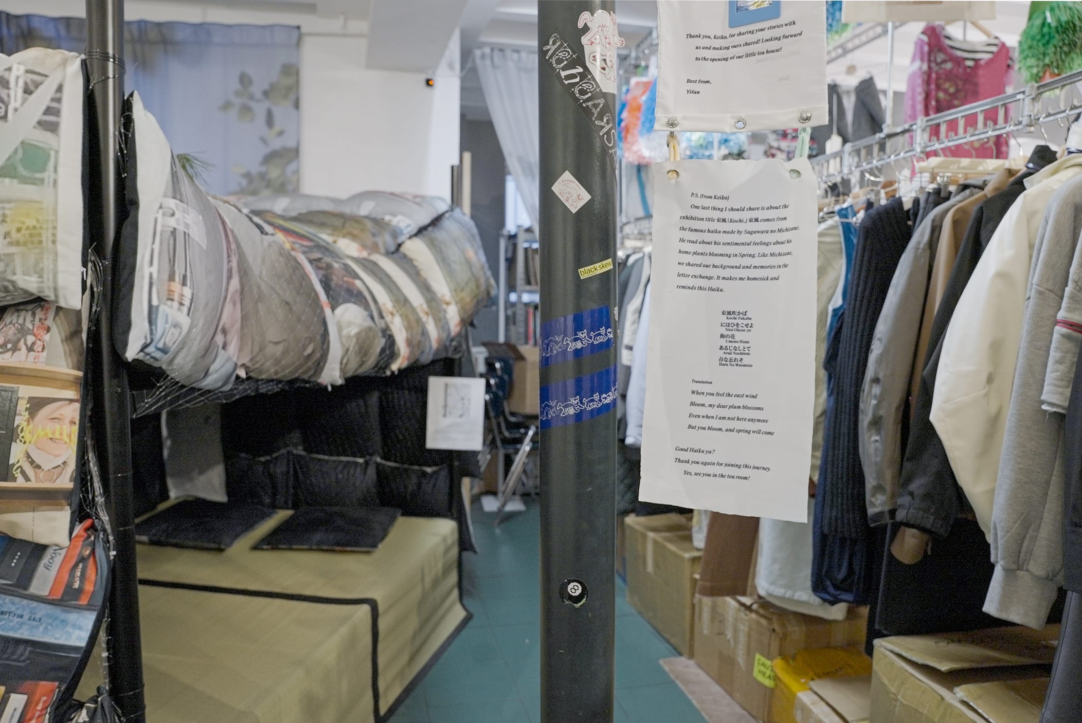
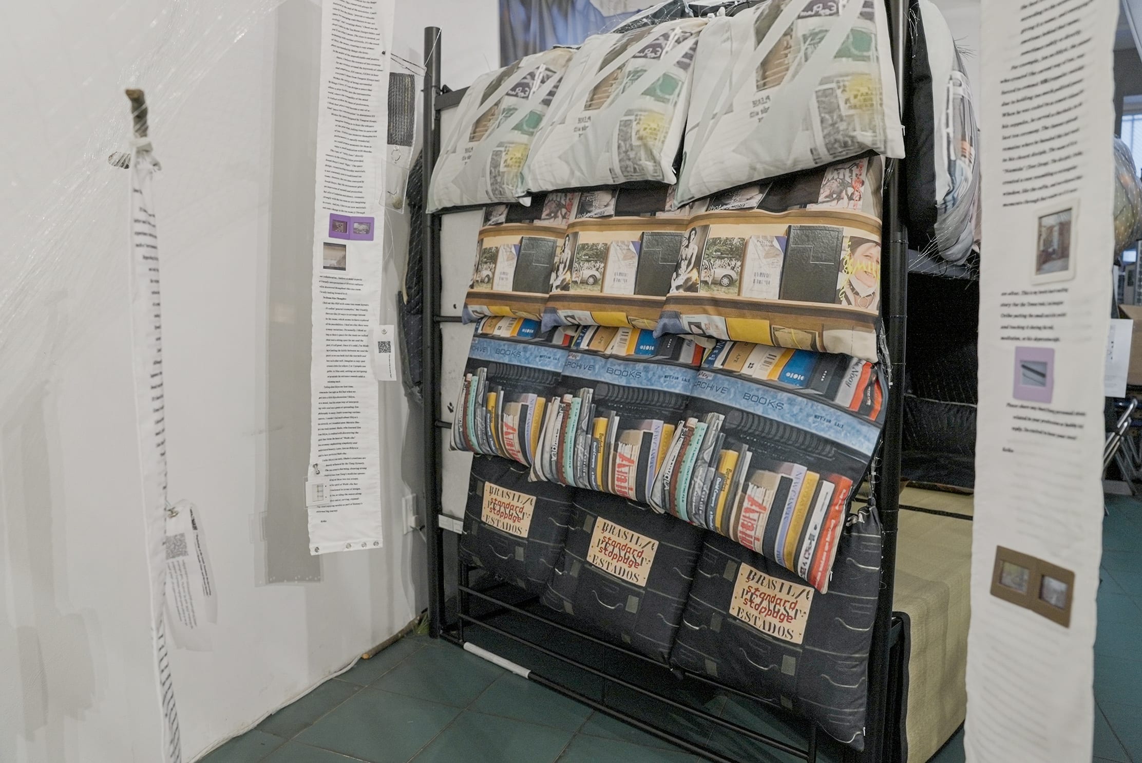
The tearoom is essentially a bunk bed turned upside down. Drawing inspiration from artist Li Juchuan's "Dorm" ("宿舍," Song Art Museum, Beijing, curated by Li Jia, 2023), where he populated a room with ready-made bunk beds typical of workers' dormitories, Tangent Essays find it mischievously provocative that when flipped, the bunk bed somehow assumes architectural characters reminiscent of a tearoom - an elevated platform, a low-hanging roof, dimensions akin to a tatami mat, and an enclosure created by the bedposts. Encased by a tapestry of camouflaging pillows bound together with bungee cords, the tearoom assimilates the "white noise" - or rather the 雨音 (amaoto) - of the ambience into its outer layer, set against the silence found within a constrained space.
Keiko Taniguchi hosts a series of tea performances every Thursday & Sunday during the exhibition.
photos by Taole Zhu









Redesigning Epub Reader on iOS
Designed for ease and focus, with intuitive annotations and reading settings that fit you.
Individual Project
Led the full design process, including research, ideation, wireframing, user testing, iteration, UI design, and prototyping.
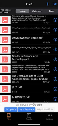
Epub Reader is one of the apps I use most often on my phone. It's incredibly convenient for browsing books and articles on the go, and its feature set is refreshingly simple - almost minimalistic, in a good way. But that simplicity comes with trade-offs.
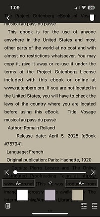
I've started to notice small points of friction: a visually uninviting file list, limited note-taking options, and reading interactions that don't always feel intuitive.
At the same time, there are features I've never touched - like file-sharing options and cloud sync - which makes me question the app's overall structure and whether its priorities match how people actually use it.
Is it just me, or are others running into the same disconnect?
I want to understand whether other users share these frustrations or if they have entirely different needs I've overlooked. What tasks are they trying to accomplish when they open this app? Where does the current experience fall short - and more importantly, how could it better support their reading habits?
My goal isn't to overload the app with features but to design a smoother, more focused experience - one that feels just as lightweight but more thoughtful and adaptable to what users actually want.
I turned to user reviews for insight since primary research wasn't allowed due to IRB restrictions. I sampled reviews directly from the App Store: 20 from EPUB Reader and 10 each from three other popular EPUB reader apps on iOS. In total, I reviewed feedback from 50 real-world users. By analyzing reviews, I hope to get a better picture of how people engage with EPUB apps and understand the user flow more broadly.
There were a few key questions guiding my review analysis:
Here are some results from the qualitative coding method.
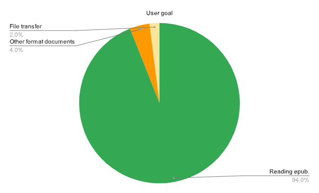
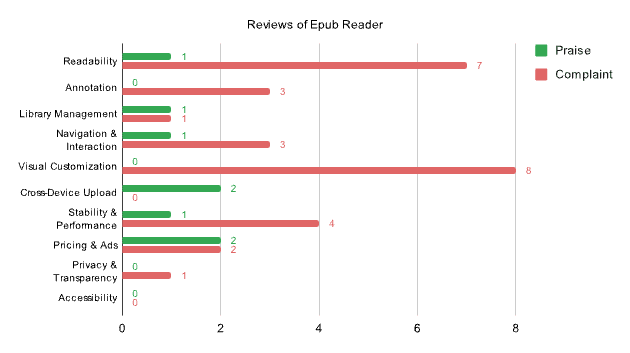
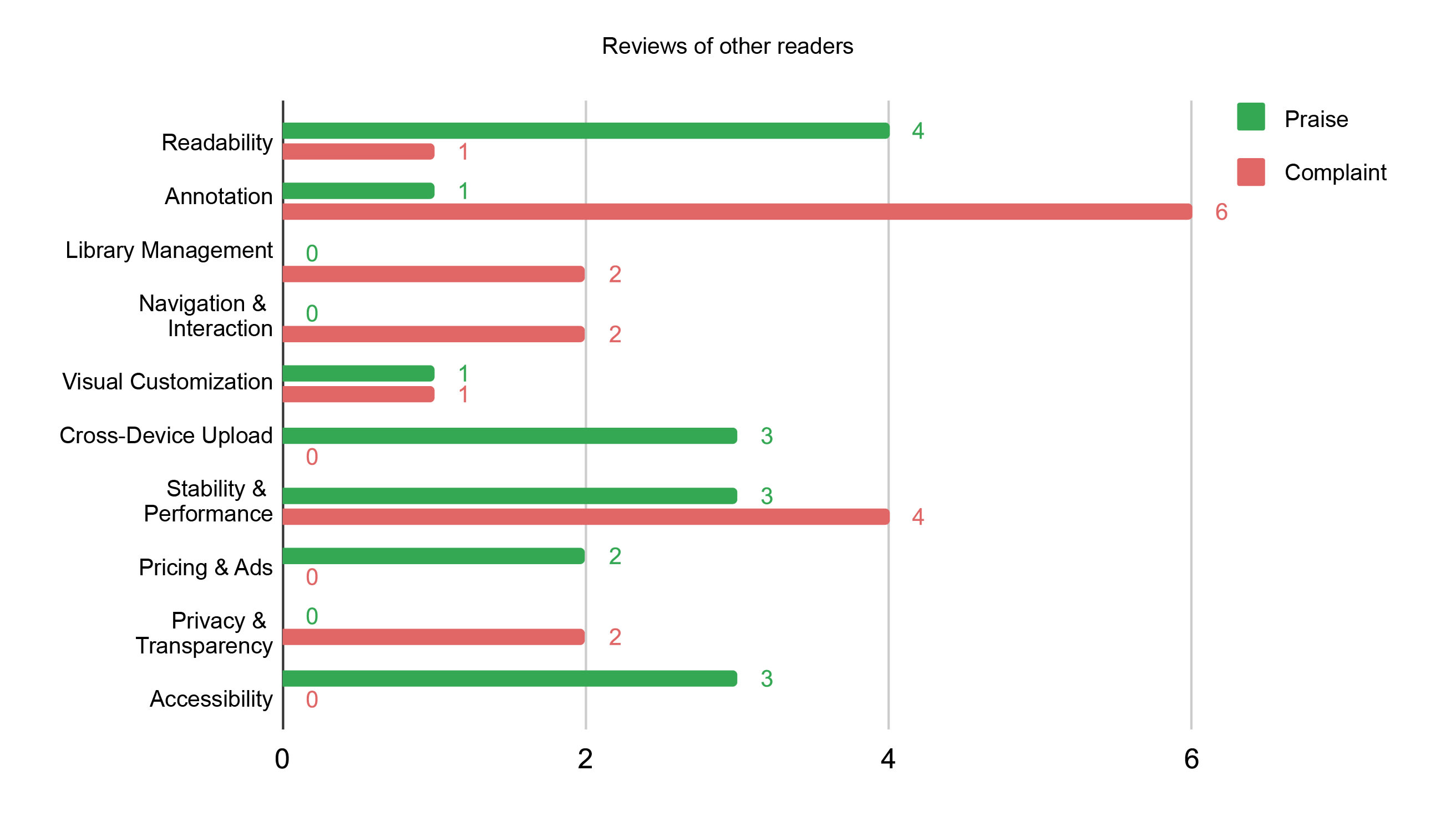
One interesting finding is that even within a single app, users can have completely opposite preferences when it comes to the reading experience.
"I'm only giving it 4 stars because you can't change the files to continuous scroll and I really don't like the page turning style."
(Selected App Store Review Quote)
vs.
"I love how I turn the pages as a real book."
(Selected App Store Review Quote)
The qualitative coding makes this clear: users, especially those of EPUB Reader, really want the ability to customize their reading mode. There's simply no single layout that works for everyone.
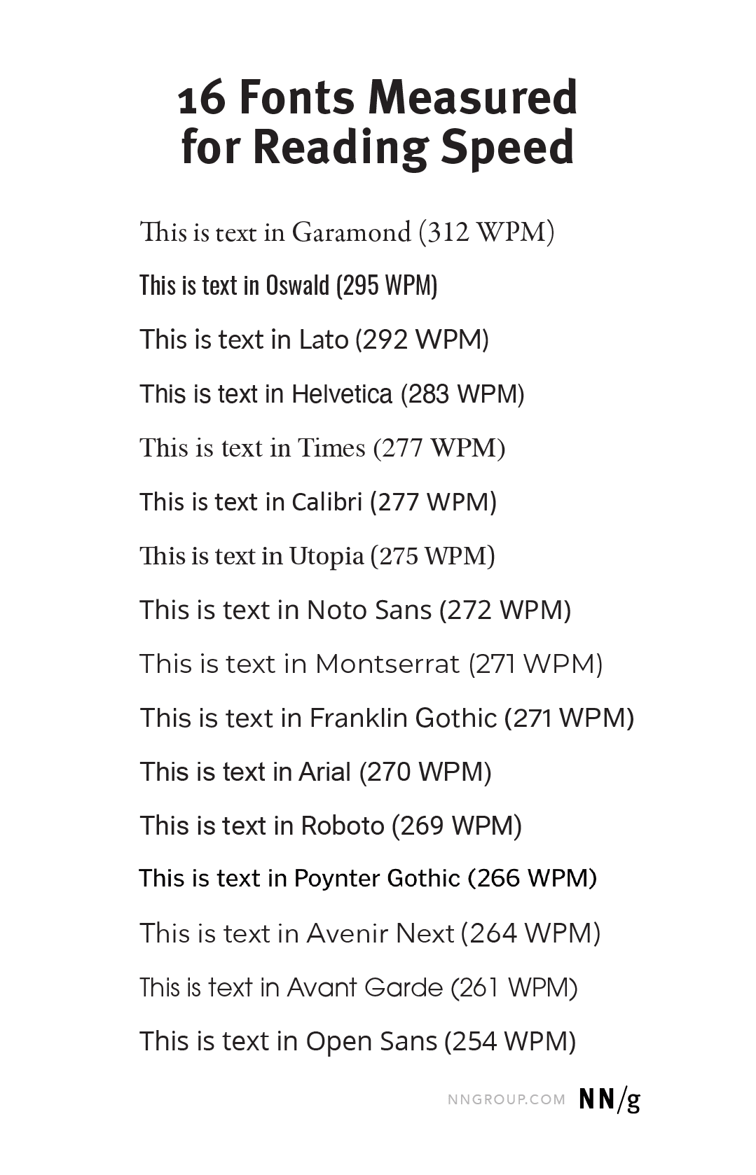
The same logic applies to readability features like font or line-height adjustment. Shaun Wallace and colleagues at Adobe conducted a reading-speed study with 352 participants and found that readers were, on average, 35% faster in their fastest font compared to their slowest. But that fastest font varied from person to person. In other words, the right visual setup makes a real difference - but what's "right" is highly individual. That's why customization is not just nice to have - it's essential.
Annotation features like note-taking, highlighting, and bookmarks received the most complaints, particularly in EPUB Reader. They lacked visibility and connection to the reading flow. Notes and highlights didn't feel integrated, making it hard for users to revisit what they marked or track their progress.
"There are none of the bookmarks you left in the previous time, no notes, almost as though you've never opened the file. For this major annoyance, the app is getting deleted."
Technical issues like screen freeze or missing content were also mentioned, but for the scope of this case study, I'll stay focused on the user experience side.
The initial design reworks the structure of the original app and introduces a key new feature: the "Notebook" tab. This tab serves as a central space to collect all notes, highlights, and bookmarks.
The reader view is also improved with more visual customization options, including multiple font choices, kerning adjustments, and text alignment controls.
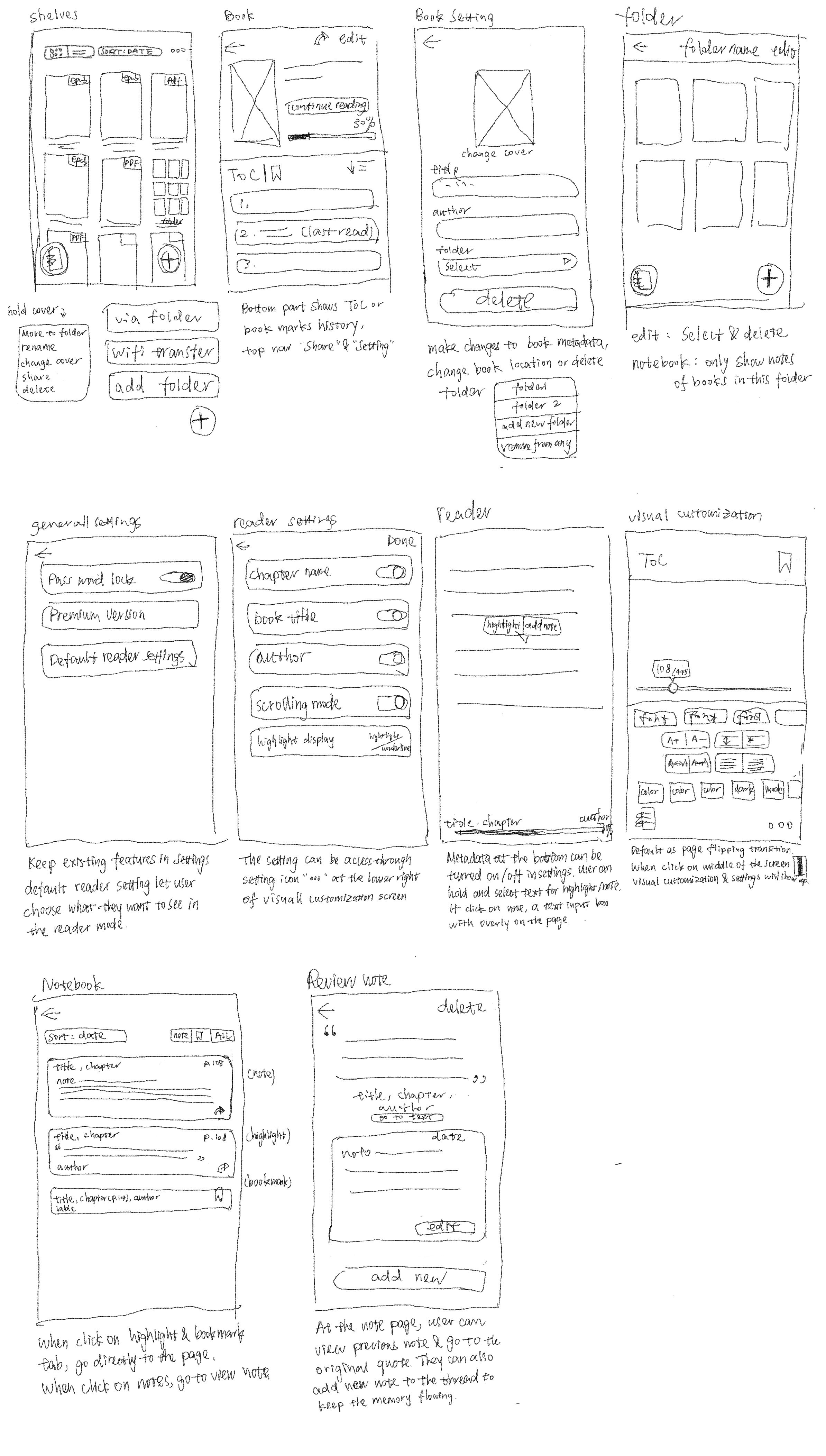
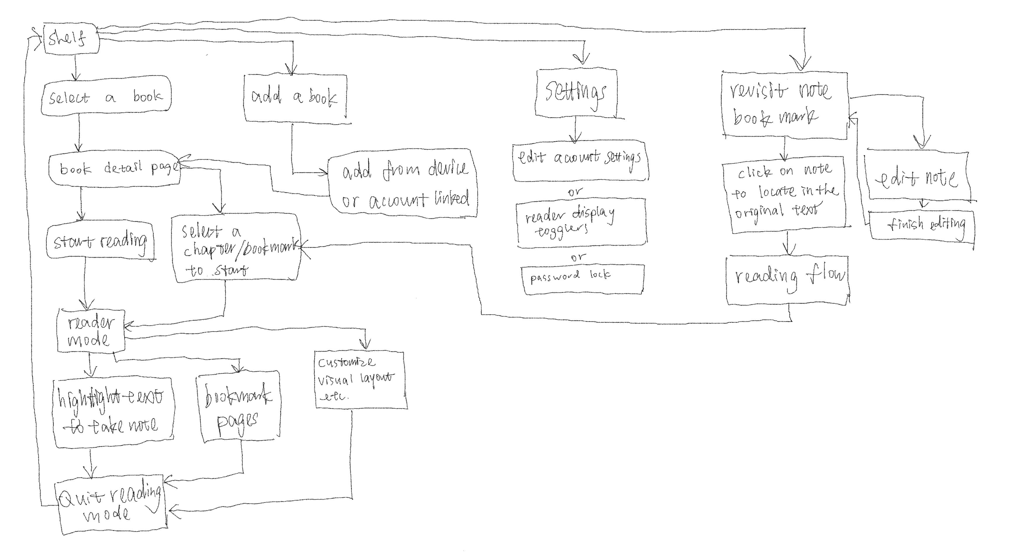
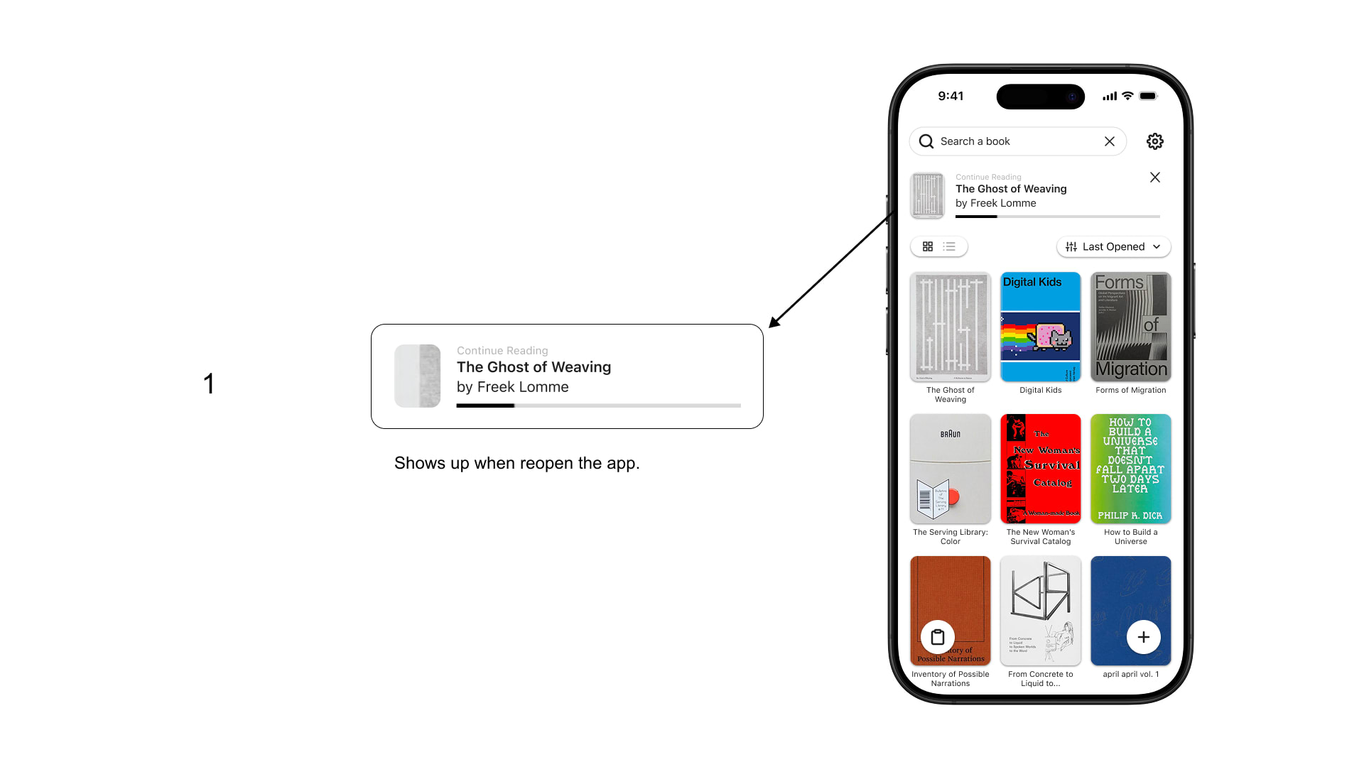
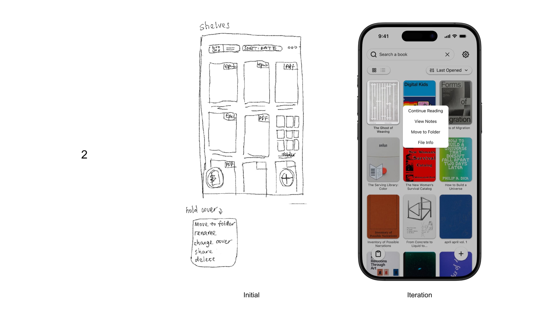
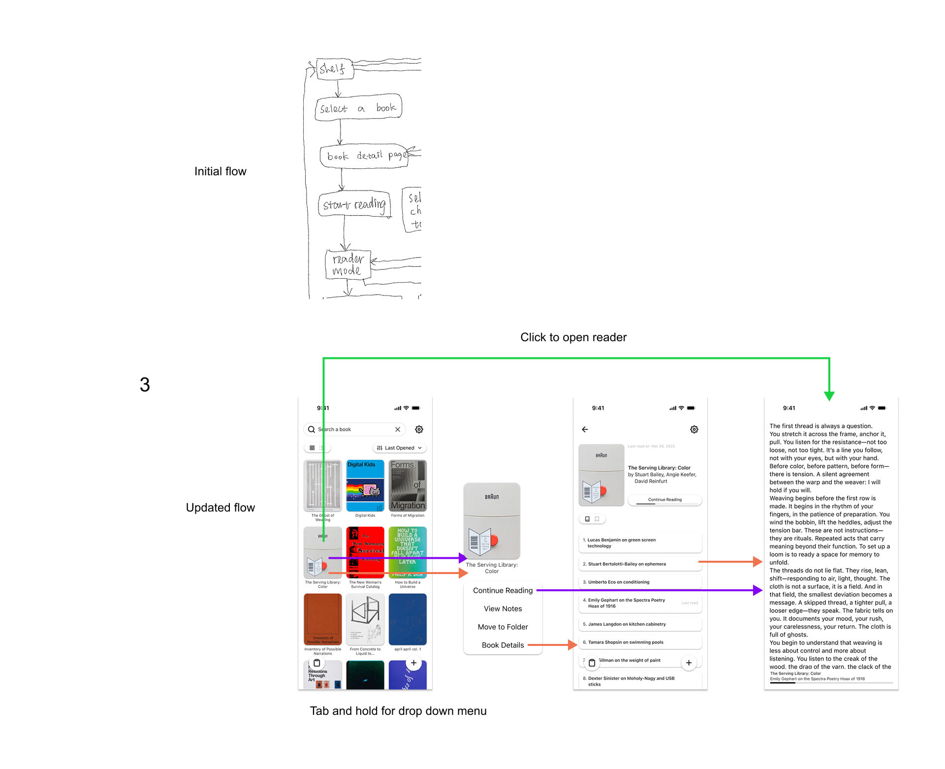
I approached testing through a simulated method since primary research is restricted. While testing, I realized the design leaned too heavily toward file & library management and drifted away from its core purpose - reading. This iteration focuses on reducing cognitive overload and keeping the interface centered around reading.
1. Short cut to last read
Added a shortcut to continue the last-read book from the home screen for quicker access.
2. Reorganized the tap-and-hold menu
Placing reading-related actions at the top while moving setup tasks to the book's settings page.
3. Streamlined the reading entry point
Clicking on a book cover now takes users directly to the reader if there's reading history.
4. Refined the file import flow
Allowing renaming and cover selection during upload.
5. Introduced a search feature and alphabet scrollbar
Helping users quickly locate titles in larger libraries.
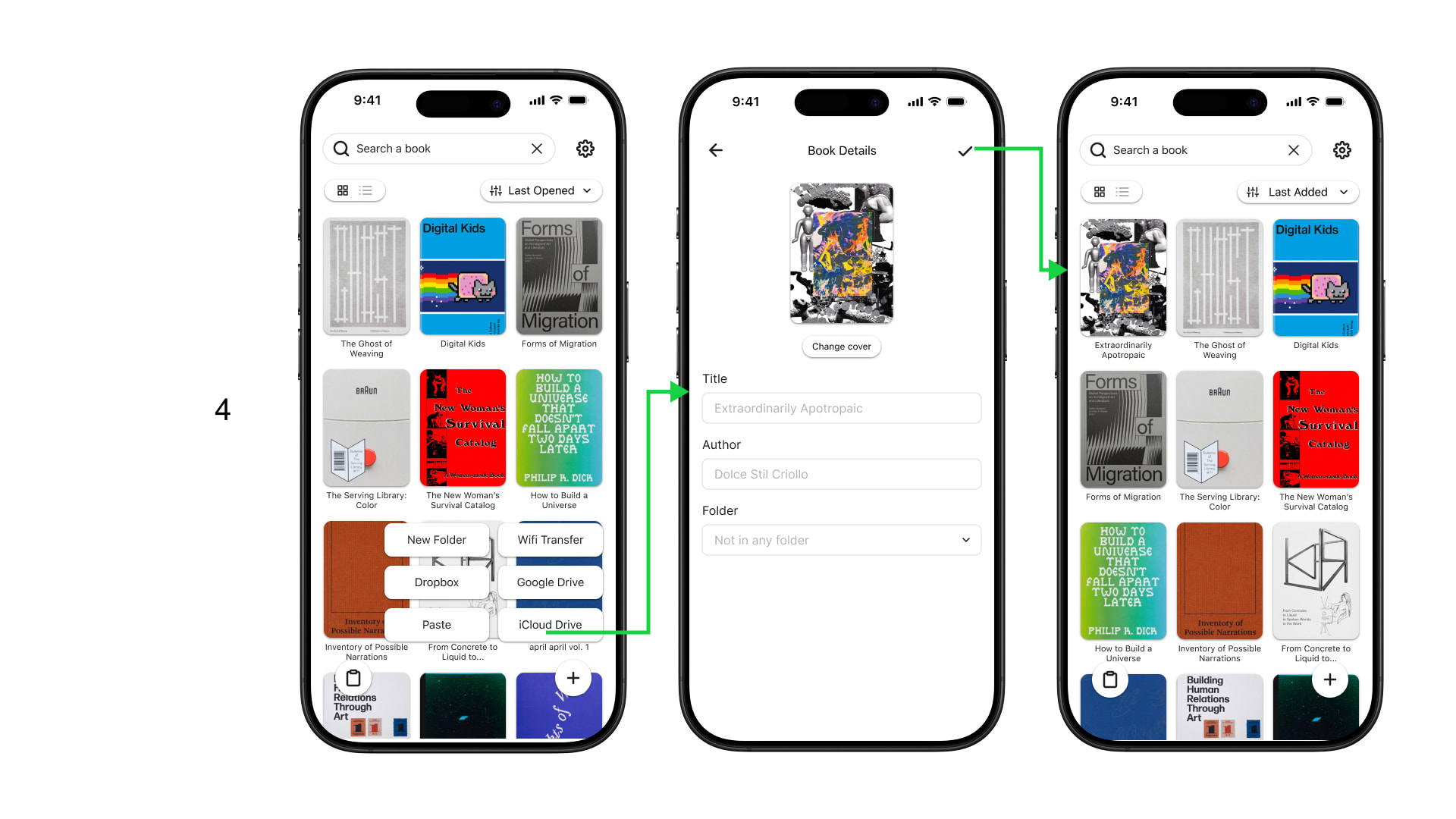
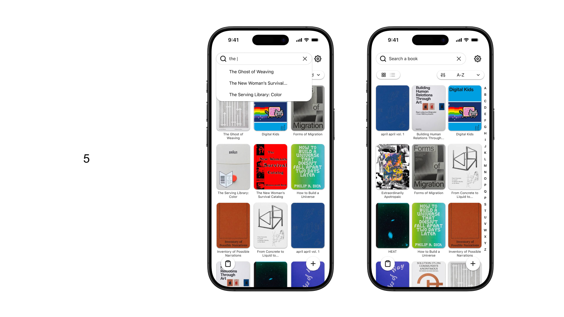
Here's a prototype where you can get a feel for the reading experience.
The curiosity and drive to seek knowledge live in everyone - so the reading experience should be accessible to everyone, too. In my vision, the app should be inclusive of users with visual or physical impairments, ADHD, dyslexia, and other diverse needs.
Features like TTS, auto-scroll, voice commands, and bionic reading aren't just beneficial for users with specific impairments - they can improve the experience for all users, especially in certain contexts like commuting, multitasking, or screen fatigue.

0-to-1 Mobile Experience
A faceless iOS social app, App Store Launch July 2022, for emotion-first sharing, designed to help young people express feelings, discover relatable thoughts, and continue conversations in a safer, text-first space.
Sole UI/UX Designer, Nov 2020 - Jun 2023
I owned the mobile UI/UX design from early structure to launch-facing product visuals, including user flows, onboarding, high-fidelity screens, interaction details, design system direction, and build review.
I owned the mobile UI/UX design from early structure to launch-facing product visuals, including user flows, onboarding, high-fidelity screens, interaction details, design system direction, and build review.
Quesay needed to make emotional sharing feel safe, expressive, and engaging without becoming another noisy social feed.
The design challenge was to create intimacy, clarity, and emotional recognition inside a simple mobile experience.
The product team defined Quesay's language and core concepts.
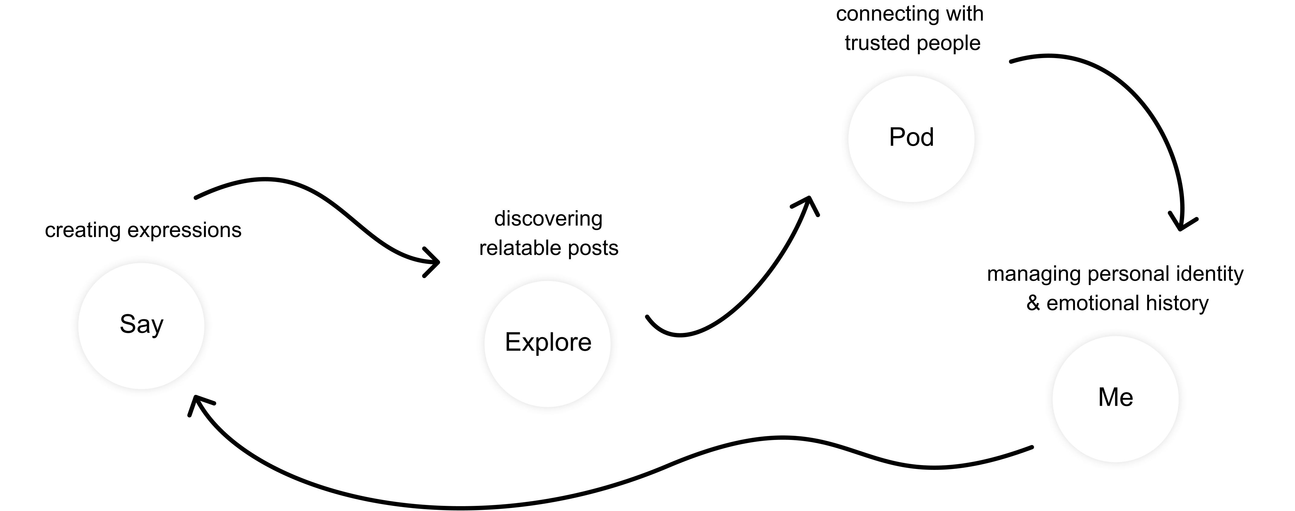
My role was to turn that vocabulary into understandable product flows, screen structures, and interaction patterns across Say, Explore, Pod/Friends, and Me.
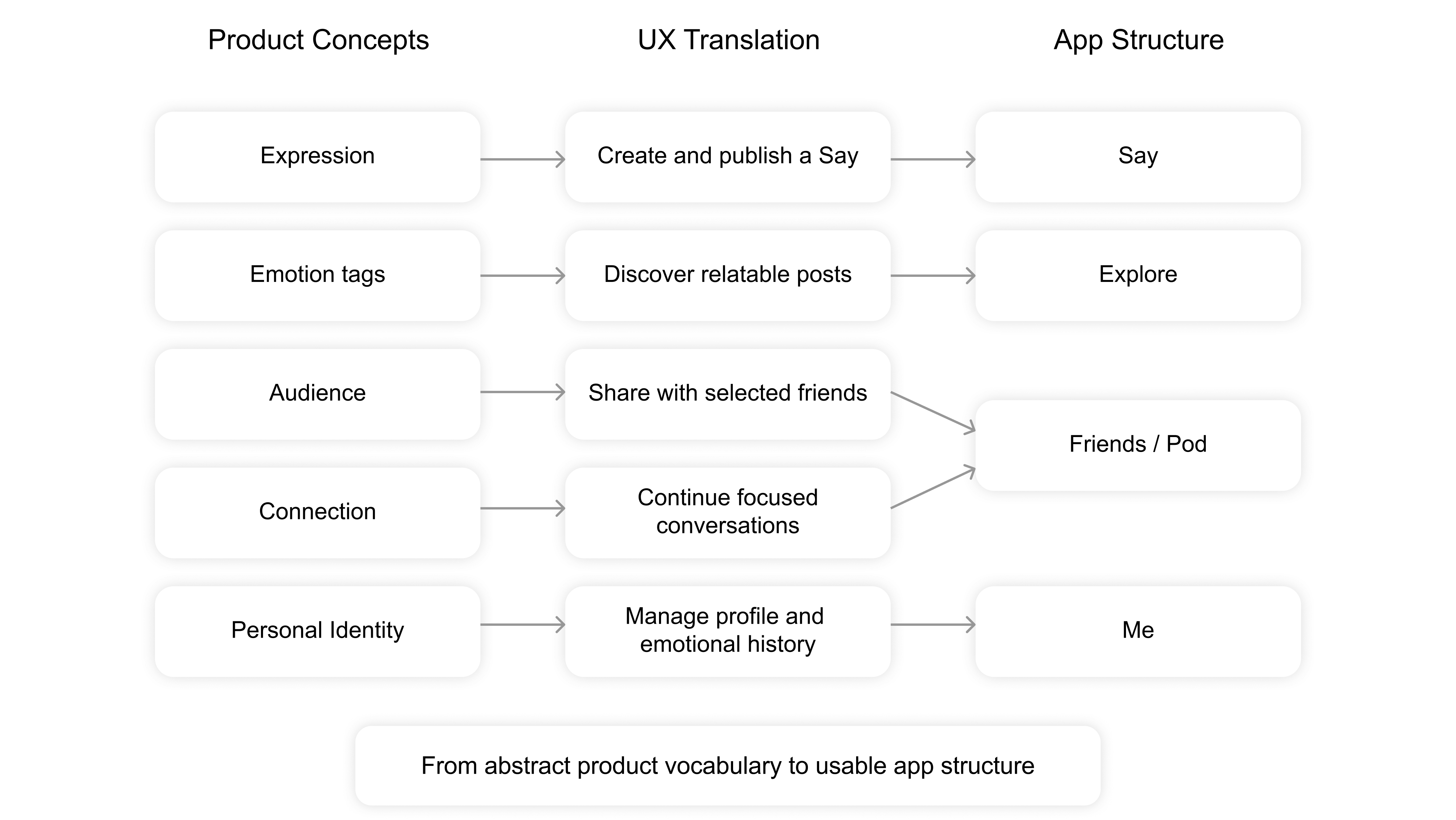
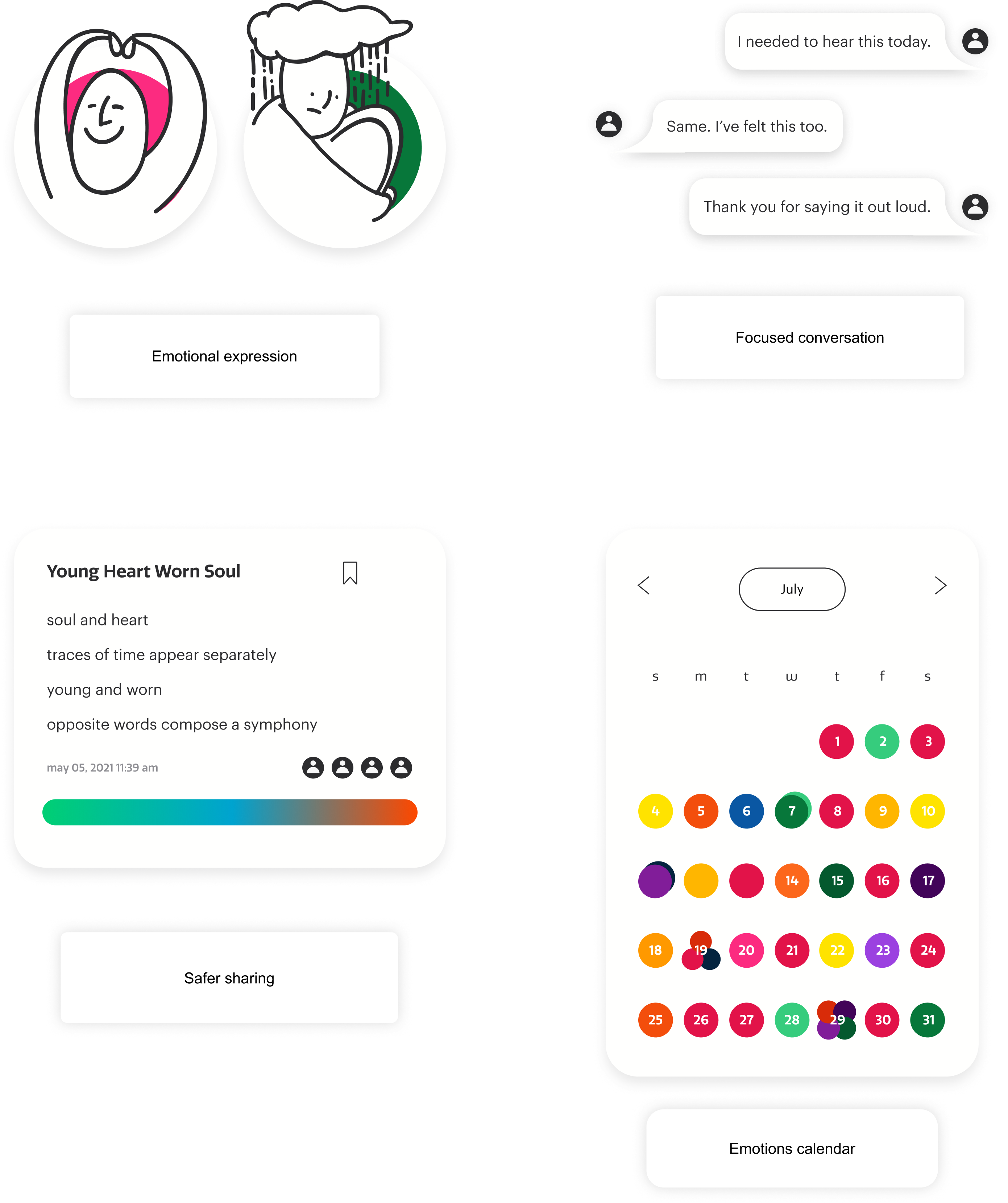
I organized the app around four core behaviors:
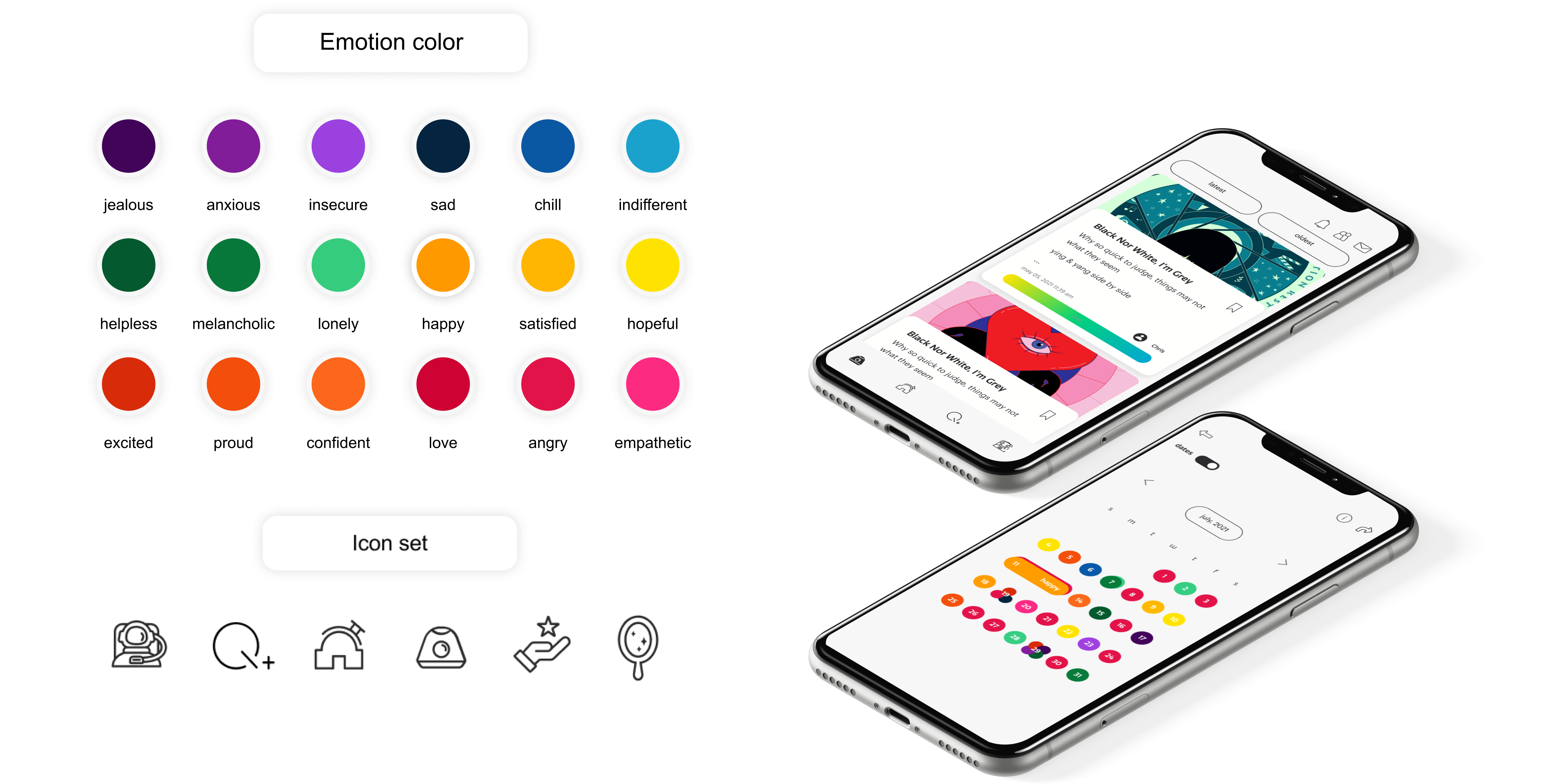
The interface was intentionally neutral.
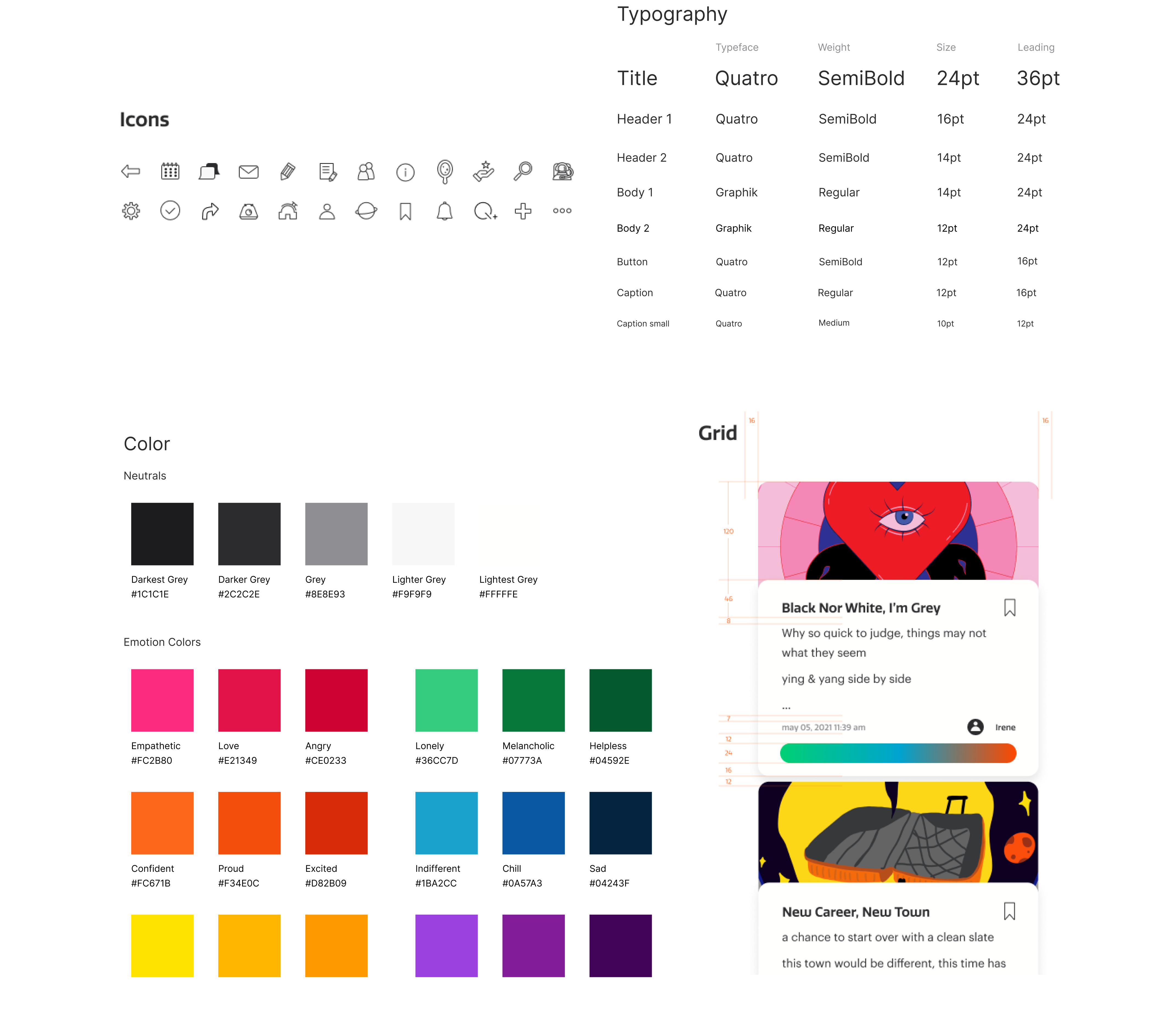
Orange carried the brand personality, while emotional colors were reserved for meaning: mood tags, gradient bars, and emotional states. This helped the product feel expressive without visual clutter.
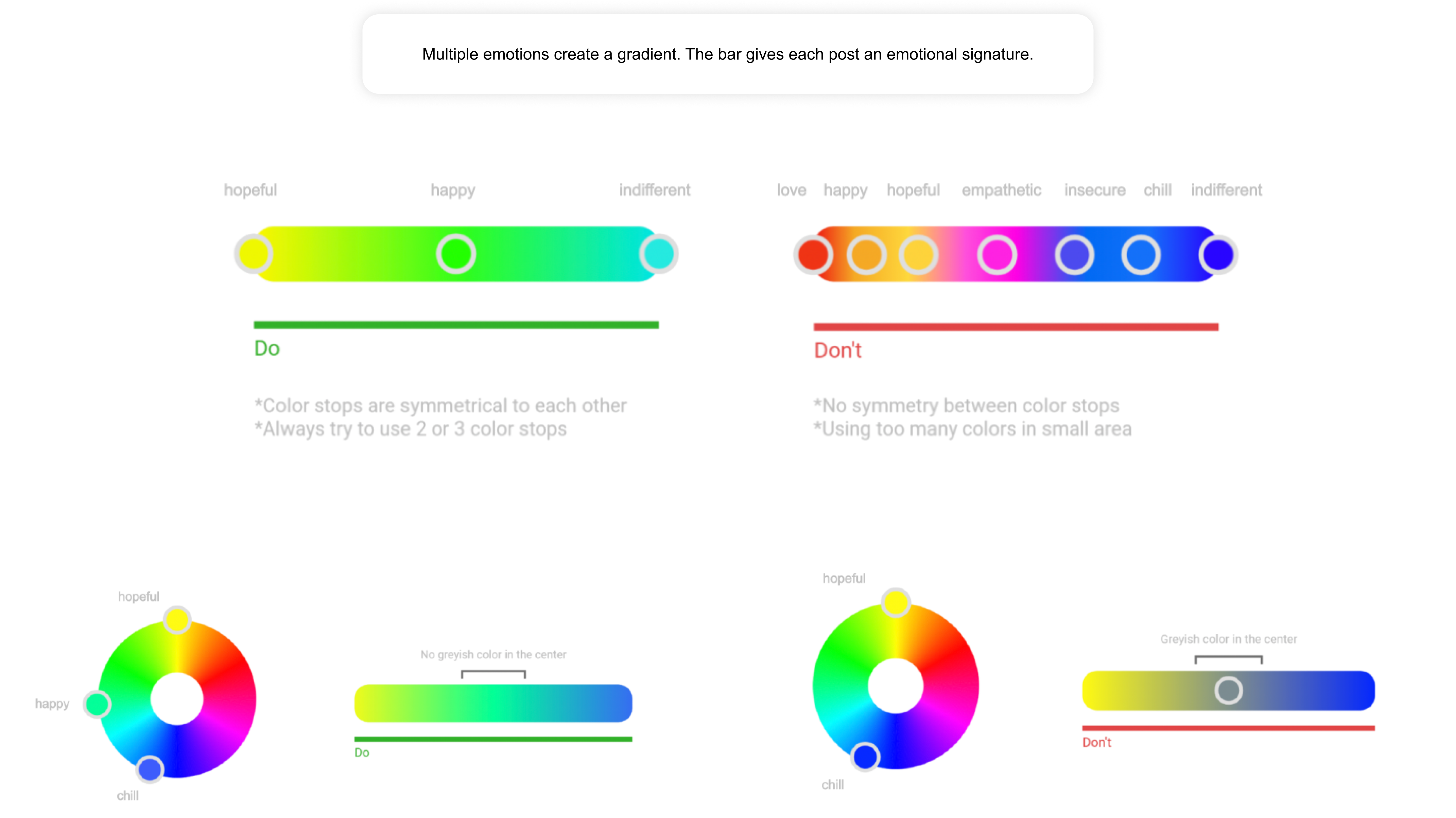
The gradient bar became a compact visual language for emotion. Each color represented an emotional tag, helping users scan the emotional tone of a post before reading deeply.
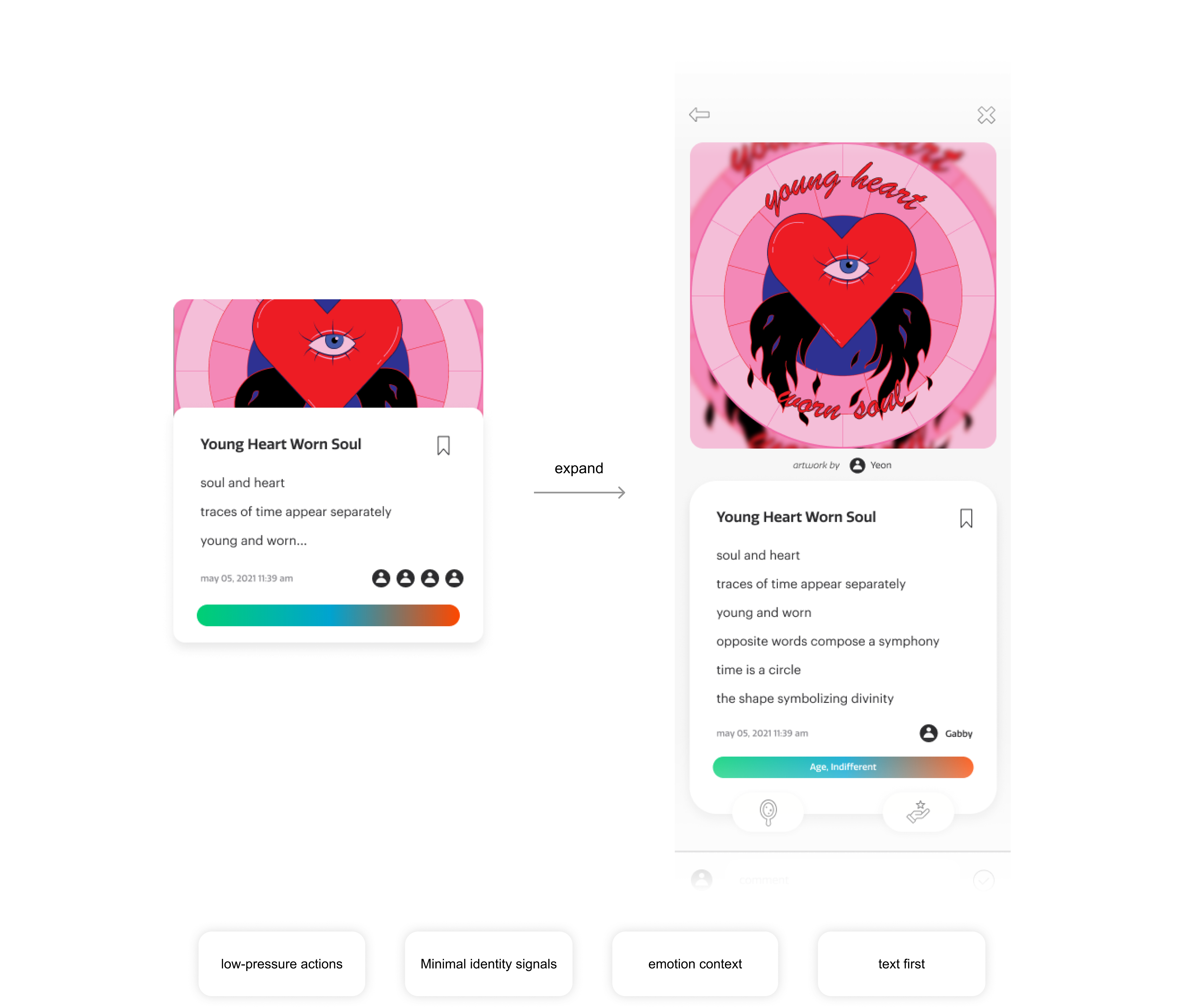
Expression cards prioritized written thoughts over profile identity. The layout kept text at the center, supported by emotional tags, lightweight actions, and minimal visual noise.
The onboarding and sign-in flows introduced safety and product expectations early through invite code, age check, account type, EULA, profile setup, and emotional check-in.
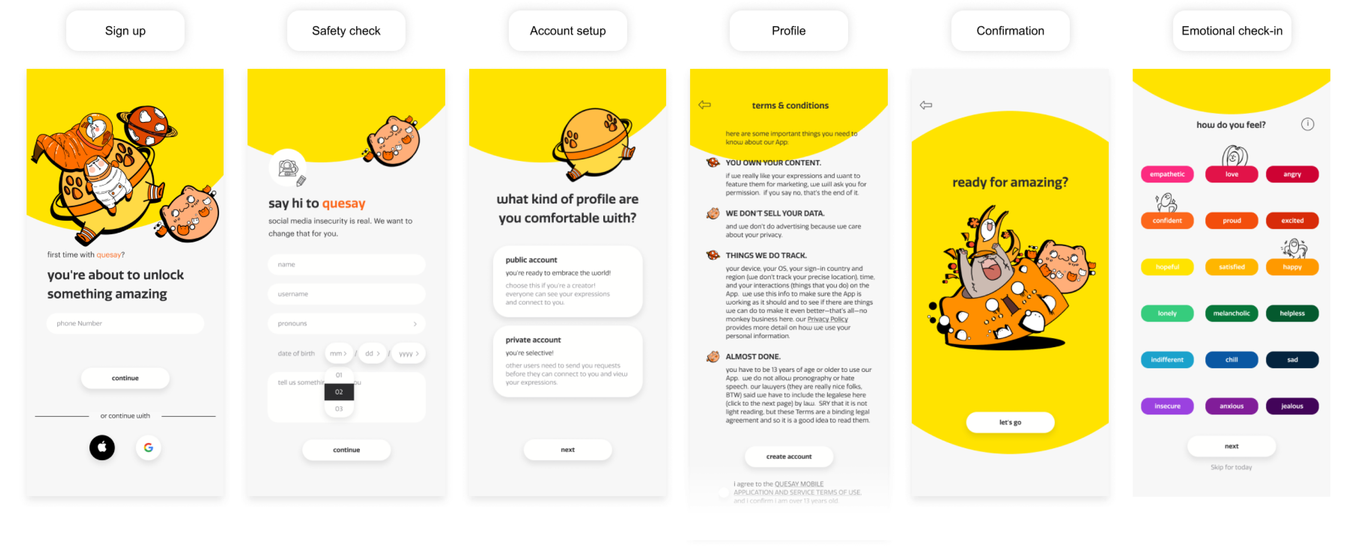
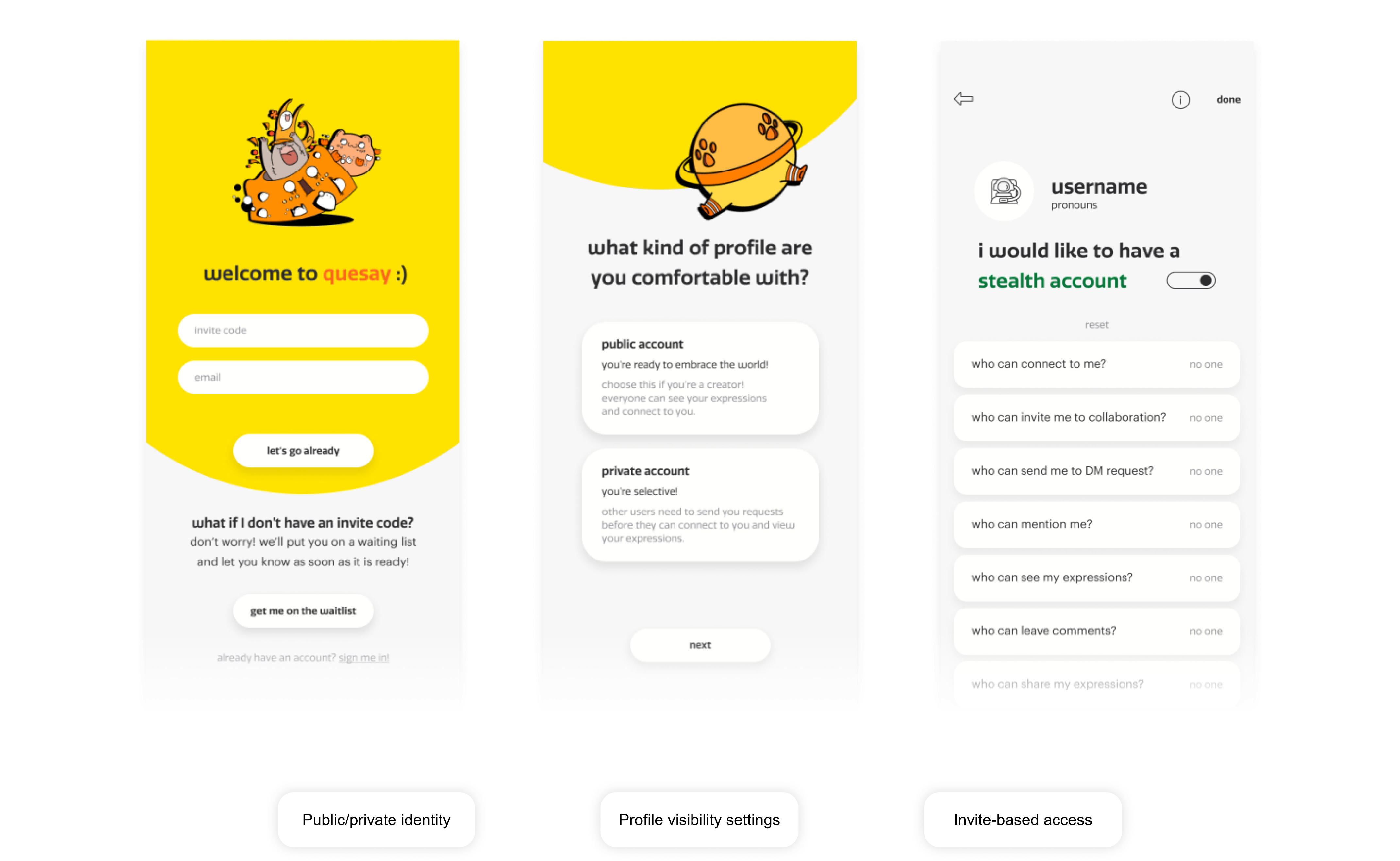
I contributed to the privacy and audience-control experience by designing flows that helped users understand where their expressions would go, who could see them, and how they could share more selectively.
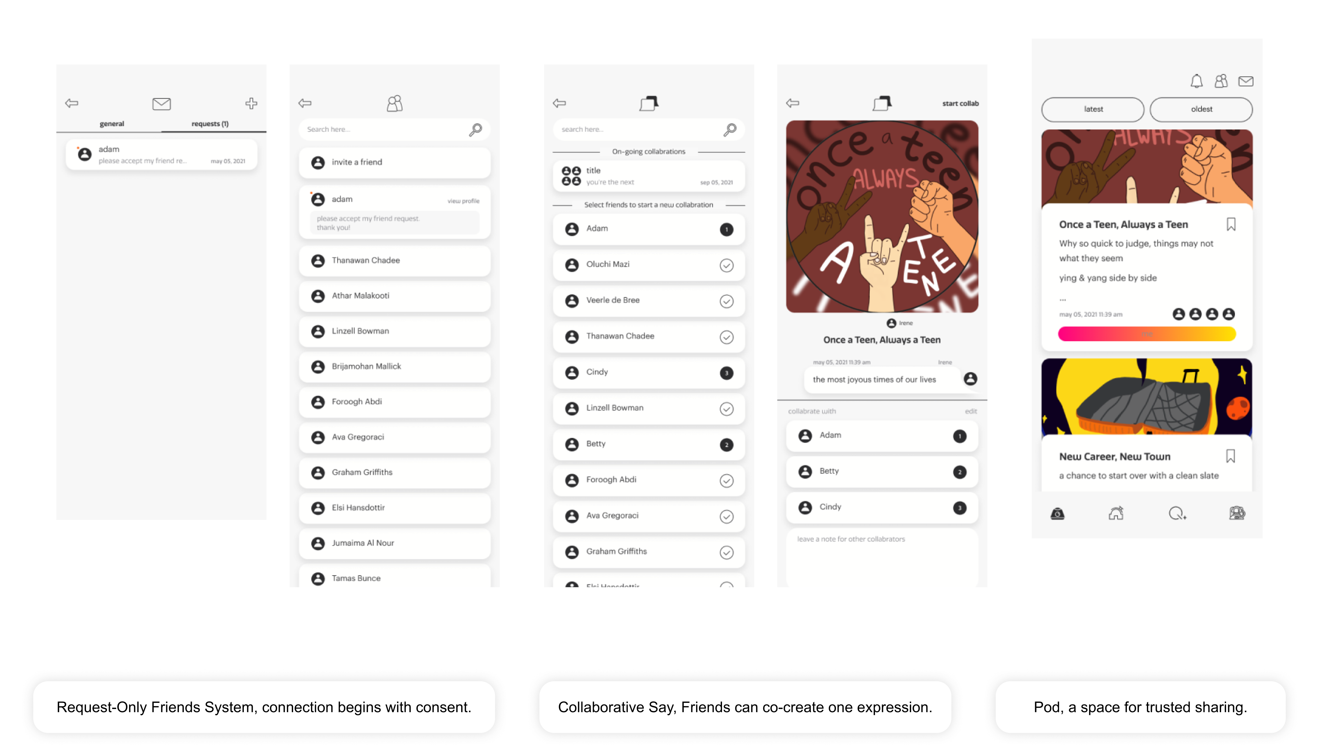
Quesay's social experience was designed around trust rather than popularity. Friends and Pod-related flows supported smaller circles, intentional sharing, and emotionally relevant connection.
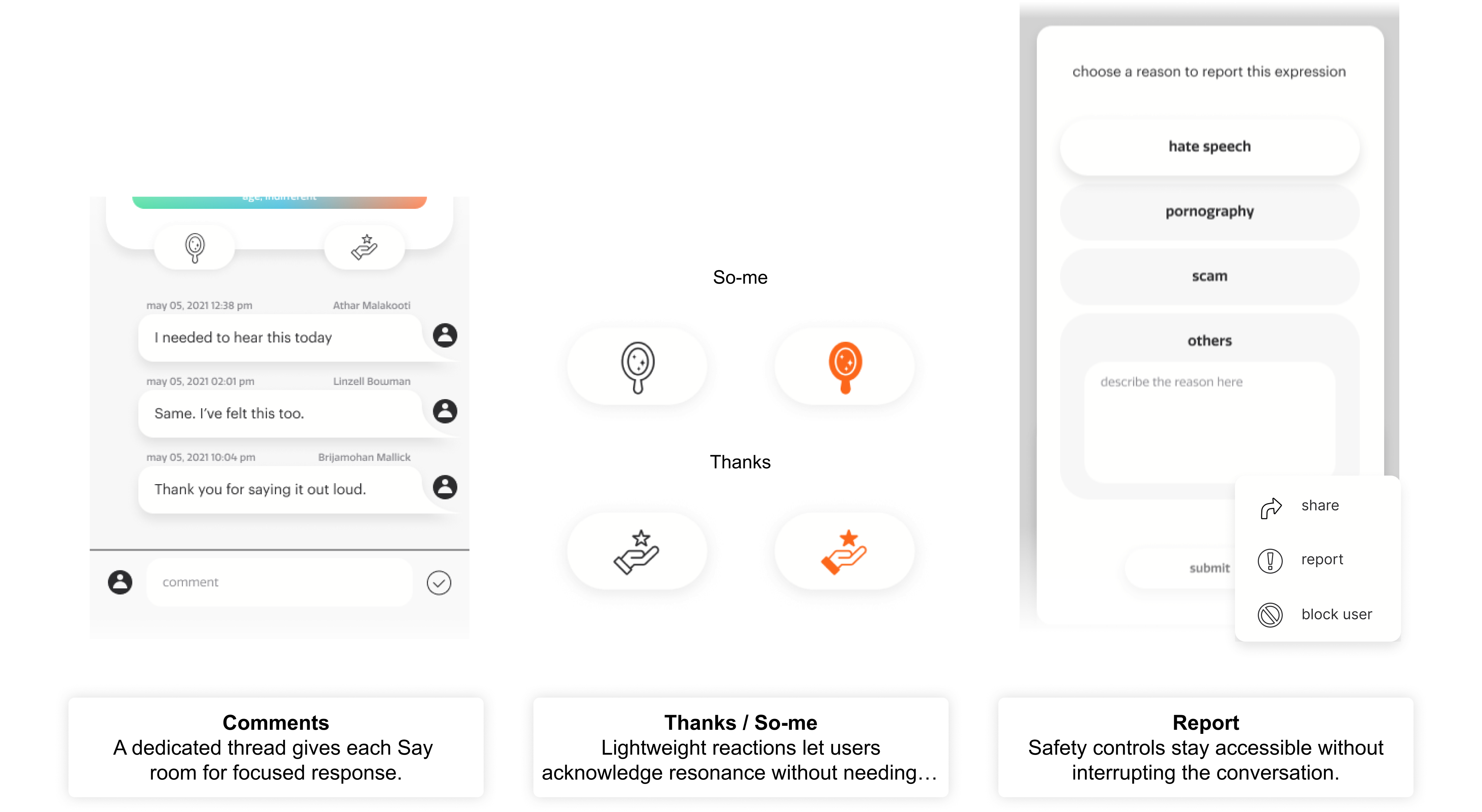
Comments were separated into a focused conversation space, giving each expression room for deeper response. Lightweight reactions like Thanks and So-me supported emotional acknowledgement without overwhelming the post.
To keep Quesay expressive but consistent, I built a neutral UI foundation supported by rules for brand color, emotion colors, typography, icons, dark mode, and reusable interface states.
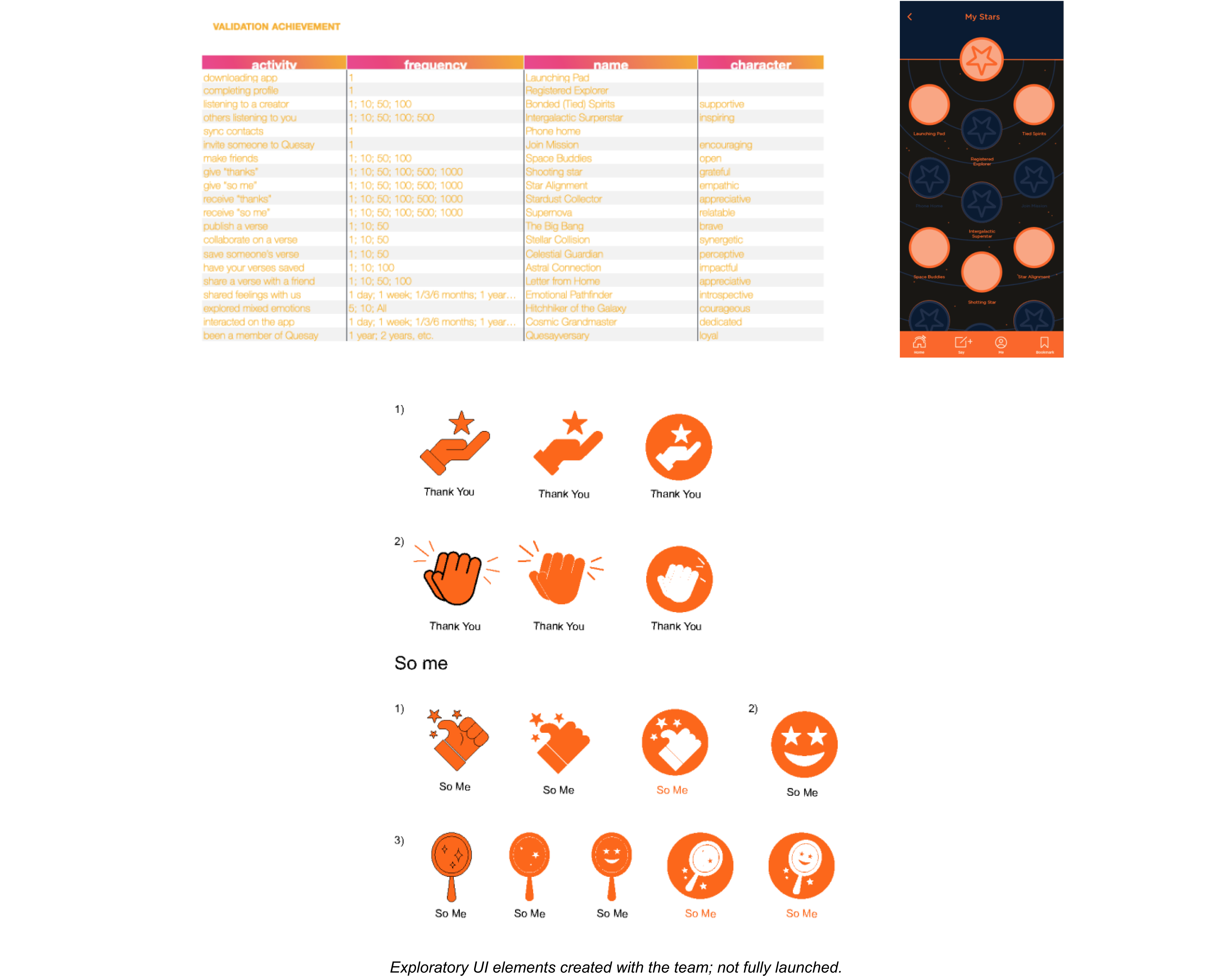
I explored UI for a validation system that could reward meaningful participation, such as completing a profile, inviting friends, publishing expressions, joining weekly conversations, and collaborating.
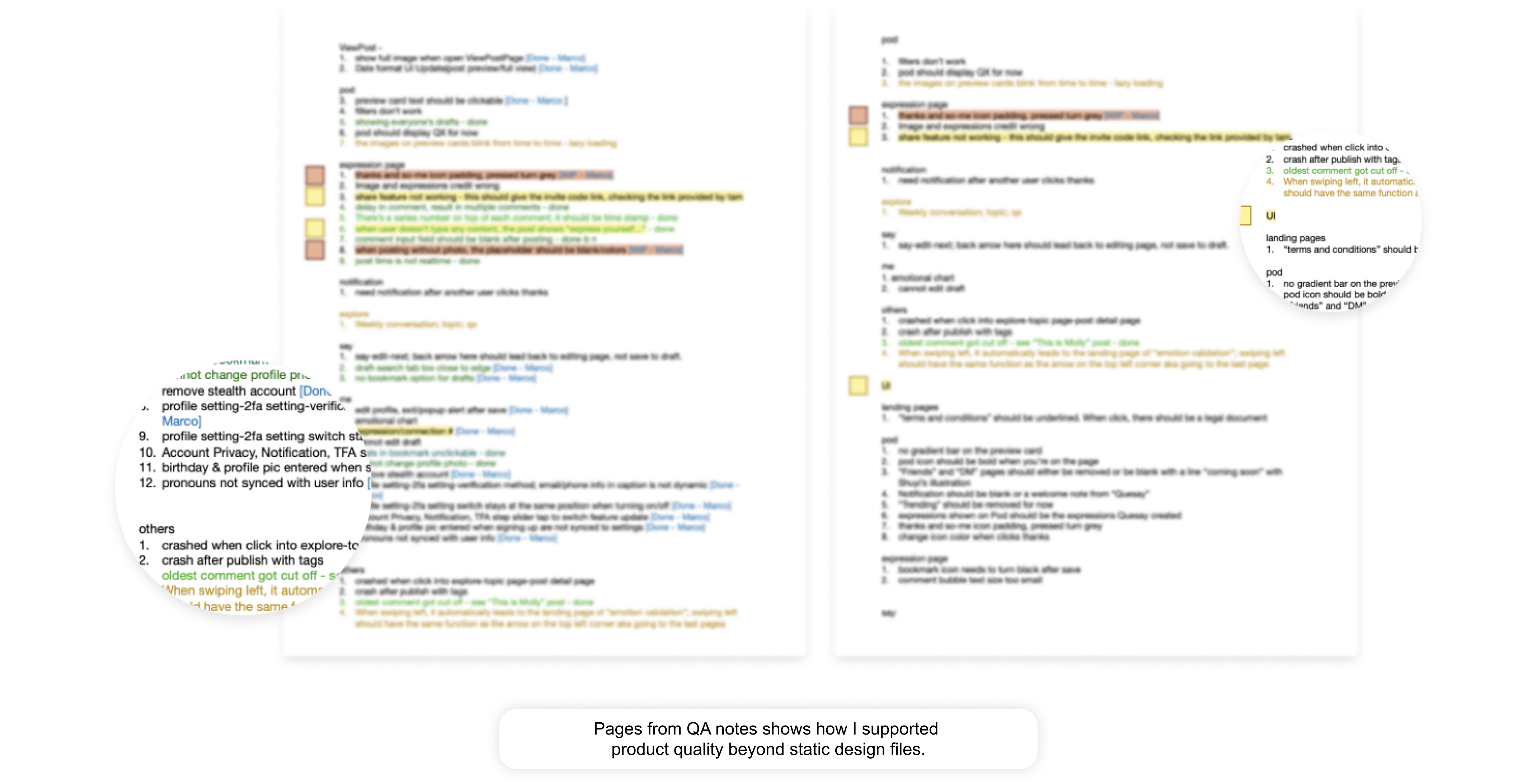
As the product moved into implementation, I joined build reviews and helped identify UI and interaction issues across comment layout, notification behavior, icon padding, loading behavior, and menu actions.
Quesay launched on the Apple App Store in July 2022.
My design work helped turn an abstract emotional-social concept into a structured mobile product with a clear visual system, safer sharing flows, focused conversations, and launch-ready product storytelling.
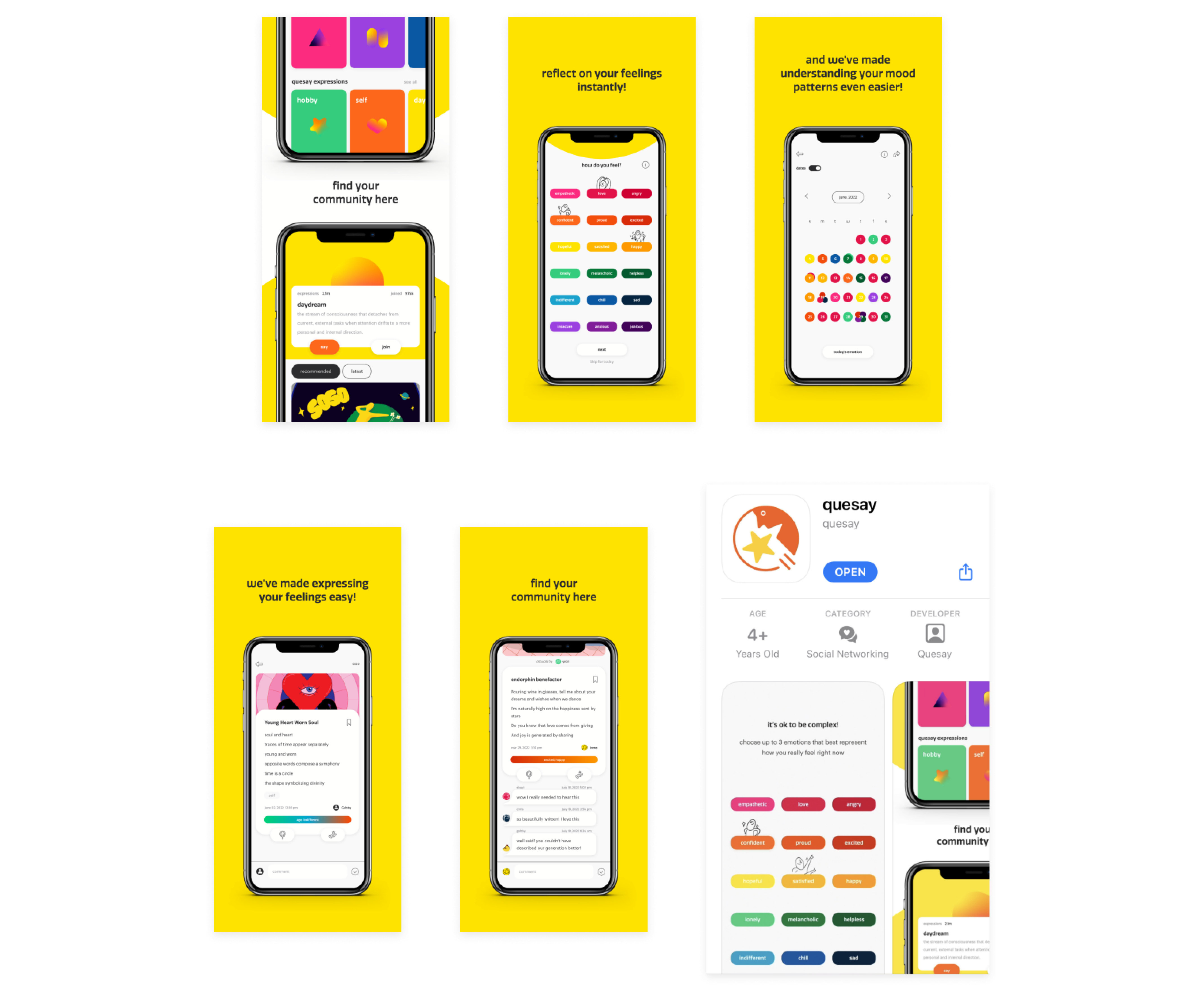
Quesay taught me that emotional products depend on more than expressive visuals. Safety, hierarchy, privacy, conversation design, and implementation details all shape whether users feel comfortable enough to share honestly.
AnimalLove
A UX research and service design case study exploring how AnimalLove can improve fostering, adoption support, and collaboration across local rescue communities.
Group Project, Team of 4
UX Research / Service Design / Social Impact
Role: UX Researcher & Product Designer
After the pandemic, many shelters faced pressure from pet returns, rising care costs, and overcrowding. The report notes that around 23 million U.S. households adopted a pet during the pandemic, but many people later returned to office routines while inflation made pet care harder to afford. It also cites that 44% of pet owners had used credit cards to pay for pet expenses (PBS NewsHour. 2023, February 20), connecting financial pressure to possible pet relinquishment.
Animal rescue is not only about finding people who love animals. It is also about timing, resources, communication, and support. When more animals enter the system than the system can support, rescue organizations need better ways to connect animals with adopters, foster families, veterinarians, and local communities.
AnimalLove is a nonprofit rescue organization in Queens, NYC, facing pressures similar to many animal shelters across the United States.
At first, the problem looked like a simple lack of adopters or foster families. But as we looked deeper, we saw that the challenge was connected to a larger system. This Project, our team studied its fostering and adoption challenges through secondary research, field observation, and stakeholder interviews.
Animal shelters play an important role in rescuing lost, abandoned, and stray animals. They provide temporary care, medical support, and a pathway for animals to find foster families or lifelong homes. In the U.S., there are about 4,400 brick-and-mortar animal shelters, and around 6.5 million animals enter shelters each year.
Fostering Option: Shelters struggle to find foster homes, particularly for animals with special needs or behavioral challenges.
Data Standardization: There is a need to develop standardized data-sharing system.
Collaborative Framework: There is a need to establish clear guidelines for collaboration between shelters, academic institutions, corporations, and other stakeholders.
Each stakeholder sees only part of the rescue journey. Staff manage daily operations. Rescuers bring animals in. Veterinarians support medical care. Foster families provide temporary homes. Adopters need long-term guidance. Without a shared system, information can easily get lost between these groups.
Rescue staff / management Rescuers Veterinary. hospitals Foster families Adoptive families Other shelters Animals in care Volunteers Academic / corporate partners Local rescue communitiesTo understand the problem from both system and human perspectives, our team used three research methods: literature research, field observation, and stakeholder interviews. The literature review used keywords such as animal shelter issues, fostering recruitment, and animal welfare design, with sources from Google Scholar, Wiley Online Library, ProQuest, and ScienceDirect.
The research showed that the shelter system faces pressure beyond one organization. The report cites seven key problem areas in animal sheltering: animal behavior, adoption, medical condition, community, ecology and wellness, operations, and public-private-academic-corporate collaboration. It also points out that better data-sharing is still needed, since incomplete data makes research and policymaking harder.
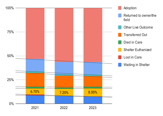
Even though adoption percentage slightly increased, shelter euthanasia also increased from 6.7% in 2021 to 8.5% in 2023, showing that adoption alone does not solve the system pressure.
(Source: Shelter Animal Count, 2023)
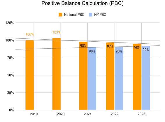
The formula SAC uses to determine if a shelter's population is increasing, decreasing, or staying the same. It simply takes the total outcomes divided by the total intakes for a time period.
(Source: Shelter Animal Count, 2023)
During field observation, three operational gaps stood out.
Rescuers dropped off animals without much direct engagement with veterinary staff.
Potential impact: gaps in health assessment and care decisions.
Foster families waited for guidance instead of actively joining decision-making.
Potential impact: disconnect between foster families and animal care planning.
Staff roles were separated across departments.
Potential impact: miscommunication, slower decisions, and less shared understanding.
The field visit helped us see that the problem was not only “not enough people.” It was also about how people communicate, how decisions are made, and how knowledge moves between different parts of the rescue process.
Scripts are set up to uncover foster program challenges, data sharing practices, collaboration and guidelines, and platforms for connections. Some key questions include:
What are the current practices and procedures in place for accommodating new rescues at the animal shelter?
What are the key challenges in collaborating with other stakeholders in the animal rescue ecosystem?
What measures do you think would enhance the effectiveness of fostering programs, particularly in attracting and retaining foster volunteers?
Do you know any platforms or initiatives that connect potential foster families with local animal shelters? If so, how effective do you find them?
What are the primary reasons for the returns of adopted animals, and how can post-return services be improved?
“Fostering saved his life and many others. It's not just about homes; it's about healing.”
Andres, Adoption Staff
“With guidance from the shelter on post-adoption support and resources, we worked through it.”
Peri, Adoptive Family Member
“Clear guidelines and ethical alignment are key to creating impactful collaborations.”
Erica, Veterinarian
The field visit helped us see that the problem was not only “not enough people.” It was also about how people communicate, how decisions are made, and how knowledge moves between different parts of the rescue process.
1. Fostering program accessibility
We assumed fostering programs were easy for potential volunteers to access. In reality, potential foster families faced barriers in finding information and getting involved.
2. Uniform data reporting
We assumed shelters had consistent data reporting. In reality, data standardization was a major issue, with only a fraction of organizations contributing complete, standardized data.
1. Economic pressure affects relinquishment
Financial strain can contribute to pet returns and relinquishment.
2. Foster homes support animal well-being
Temporary foster homes can reduce stress and increase restful behavior in shelter animals.
1. Adoption timing is not one-size-fits-all
The chance of adoption varies depending on the animal's length of stay.
2. Appearance strongly affects adoption
Animal appearance was found to be a top reason for adoption across species, suggesting a need for better presentation and storytelling.
Insight 1
Potential foster families are important for animals with special needs or behavioral challenges, but people may not know where to start or may worry about time commitment and care difficulty.
Insight 2
Stakeholders were concerned about inconsistent reporting practices. Without standardized data, shelters have less support for research, planning, and evidence-based interventions.
Insight 3
Animal rescue depends on many groups, but legal restrictions, different ethical values, and unclear guidelines can make collaboration difficult.
Besides the three main insights, the report also identified four opportunity areas: community engagement, technology gaps in adoption processes, post-adoption behavioral support, and diverse adoption preferences.
These findings helped us move from “build an adoption app” to a more specific direction: create a platform that improves discovery, support, and collaboration across the rescue journey.
AnimalLove staff and management are frustrated because the adoption and fostering system does not provide enough flexible options, especially during extreme circumstances. Potential foster families face barriers to getting involved, while the organization lacks a clear way to share information, coordinate resources, and collaborate with nearby rescue communities.
Based on the research, the proposed solution was an adoption app that connects potential adopters with animals in local shelters. The app direction prioritized simplicity, engagement, animal profiles, event notifications, fostering options, foster availability, location sharing, and a collaborative network between AnimalLove and similar communities.
Help users understand each animal's needs, personality, and adoption/foster status.
Show foster opportunities and location-based availability.
Help AnimalLove promote adoption events and urgent fostering needs.
Allow users to consider temporary fostering when shelter pressure is high.
Support information/resource sharing between AnimalLove and similar rescue communities.
The app was not designed as a standalone product. It was a design intervention for a larger rescue ecosystem. The goal was to make fostering more visible, adoption more informed, and collaboration more structured.
The team also considered real-world constraints: time, budget, technical feasibility, and stakeholder acceptance. The proposed app would need a phased development approach, transparent budget planning, technical testing, integration with existing systems, and stakeholder involvement to make sure it fits AnimalLove's actual community.
Clearer fostering and adoption options, better resource-sharing, and stronger collaboration with similar communities.
Easier access to fostering information, clearer expectations, and better support.
More informed animal profiles and better post-adoption resources.
Better chances of being matched with suitable temporary or permanent homes.
More transparent communication between shelters, veterinarians, foster families, and local communities.
Foster application completion rate
Number of active foster families
Adoption/fostering match rate
Post-adoption return rate
Time from animal intake to foster/adoption match
Number of shared resources between rescue communities
Staff and foster satisfaction score
The final design direction was an adoption and fostering app that helps AnimalLove create a more connected rescue system. Instead of only focusing on adoption, the solution also supports fostering, real-time updates, animal profiles, and resource-sharing between AnimalLove and nearby rescue communities.
Through this project, we learned that the challenge was not just about building a digital product. It was about improving the connection between people, animals, and organizations. By considering real-world constraints such as time, budget, technical feasibility, and stakeholder acceptance, the app became a more practical intervention for helping AnimalLove respond to urgent shelter needs and support animals in finding safer temporary or permanent homes.
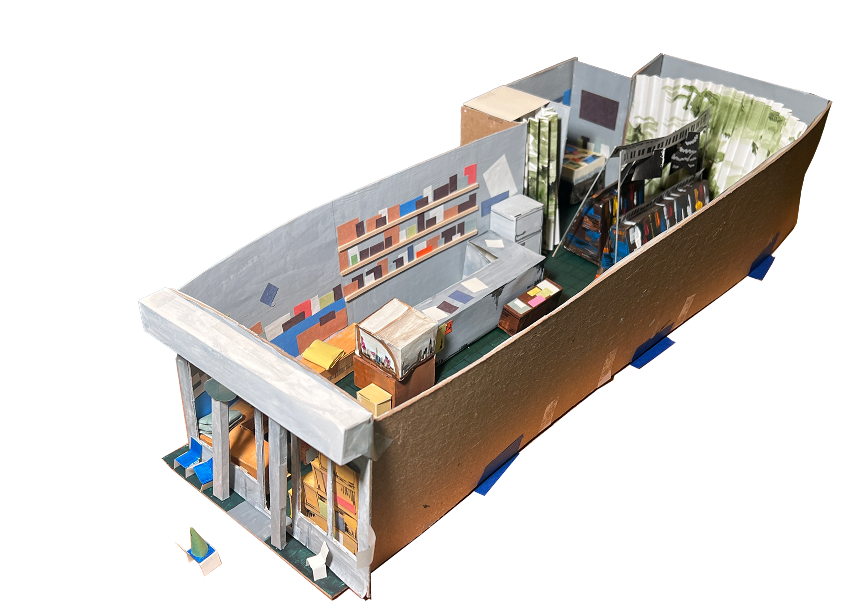
On the occasion of Bird Pit's solo exhibition I used to be your neighbor♡ at Bungee Space, June 2026, I created a website -- an online map that plots the locations of the f(ake)pigeons throughout f(ake)Bungee, a mapping of fpigeons in fBungee.
fBungee is a spherical collage based on a digital model created by Avalin Li and Stephanie Yao for NYC: As Built (Fall 2024), a course taught by Drawing Architecture Studio at the Syracuse University School of Architecture. In their version, Bungee retains its deep green floor while the space opens endlessly above.
Sewn from felt rather than paper, Bird Pit's fpigeons bring New York's most iconic urban birds into Bungee's storefront. Inside this closed sphere, they remain quietly grounded on their single wings and upside-down pizza-saver "feet".

A website for Rehearsal Art Book Fair, built as a living information space for the fair's publications, programming, archive, and support materials.
animation & motion graphics showreel
Procrastination is a task we've all faced. It might cause depression, anxiety, and of course, missing deadlines.
This project introduces the Pomodoro technique, which could keep you motivated and avoid doing things at the last minute.
What would your brain cells do while you're working? Would they think about what's for dinner or how to slack off? Here's something my brain cells do in their crazy life.
This piece received a gold award in Graphis New Talent 2020.